For over 50 years, Southwest ran on open seating — egalitarian, familiar, core to the brand. Ending it wasn't a UI update. It was a fundamental rethink of the experience, rolled out across web and mobile without disrupting an operation this size.
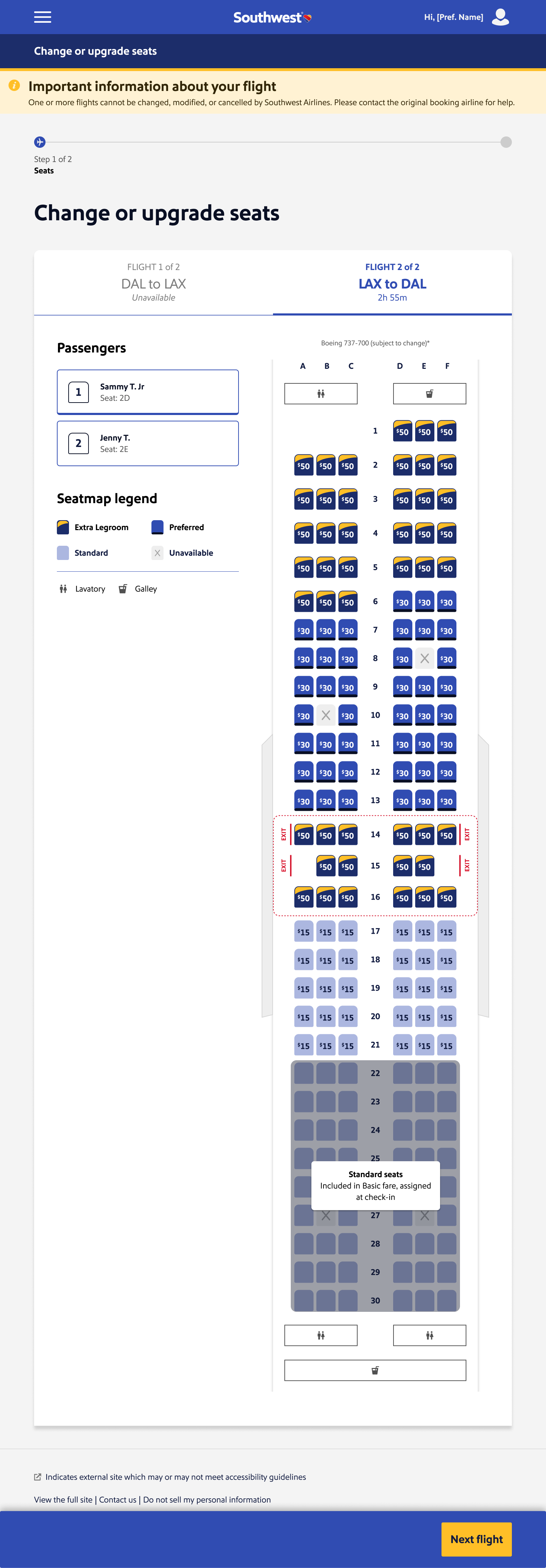
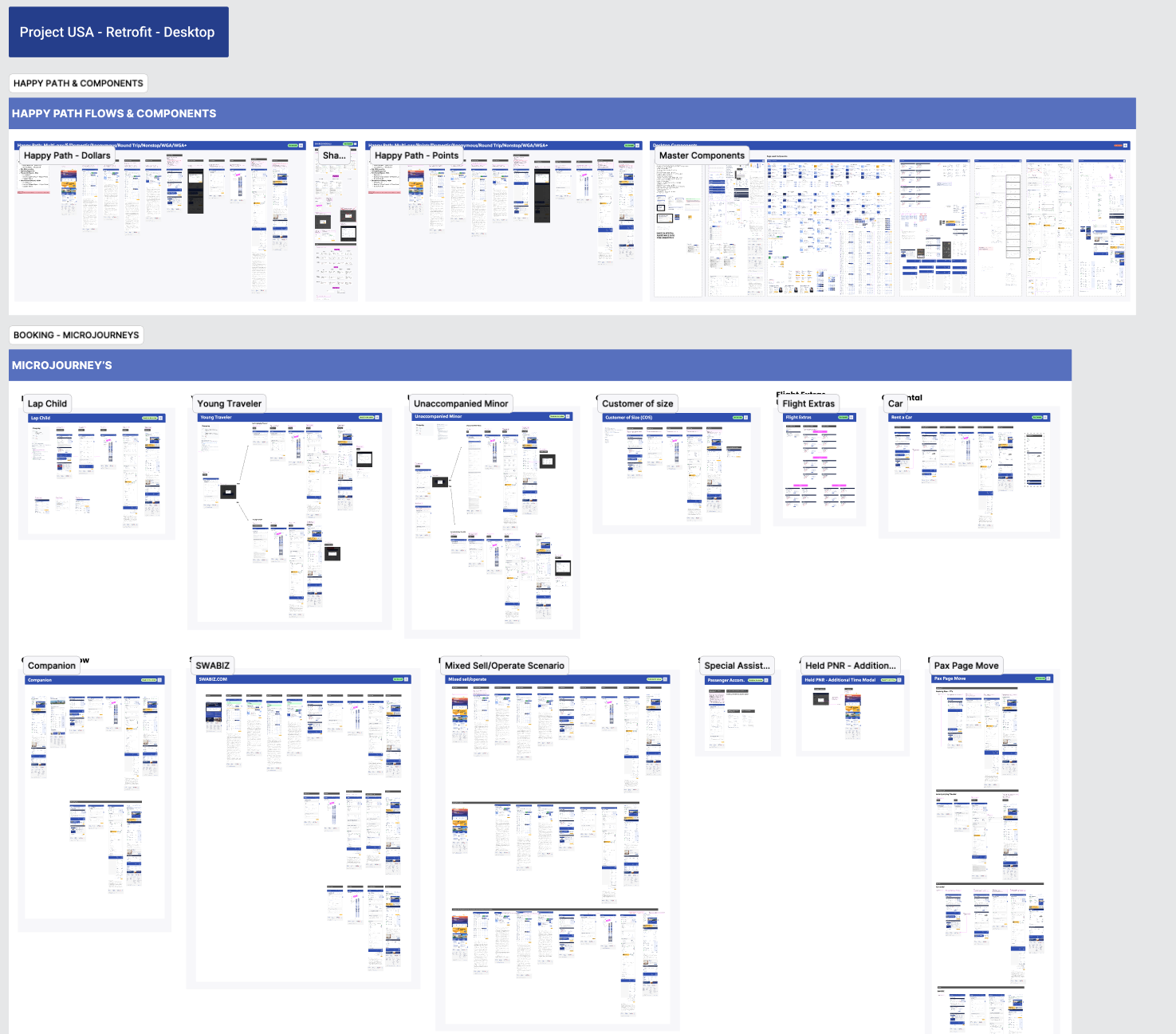
Eleven designers worked the retrofit, four of them from Southwest's internal team. I led the group retrofitting seat selection into mWeb, iOS, and Android — designing for the full matrix of edge cases: lap children, unaccompanied minors, customers of size, companion passes, SWABIZ bookings. Every permutation was organized into a micro-journey and accounted for before a line of code was written. Southwest's identity is built on warmth and simplicity, so the bar wasn't just technical correctness — new workflows had to be efficient without being cold, modern without being unfamiliar.
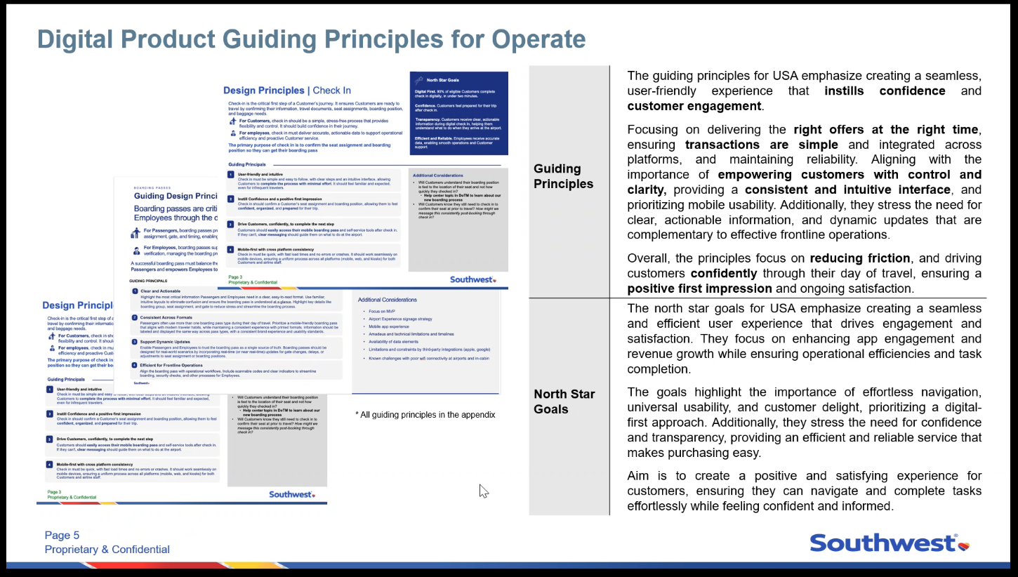
"The delicacy of the retrofitting relied on balancing well-known flows thousands of people used daily, while weaving in new experiences without major upheaval."— from the engagement's working principles
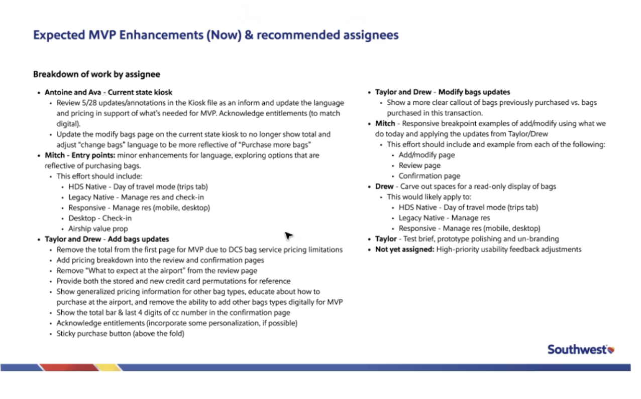
Before a single screen was designed, the team aligned on a clear breakdown of MVP enhancements and ownership — entry points, bags updates, modify flows, and responsive breakpoints, each assigned by name, myself included. A companion flow matrix carried every micro-journey: lap child, young traveler, unaccompanied minor, customer of size, companion pass, SWABIZ, and more. Leading a team this size still meant owning a direct slice of the work, not just directing it from above.
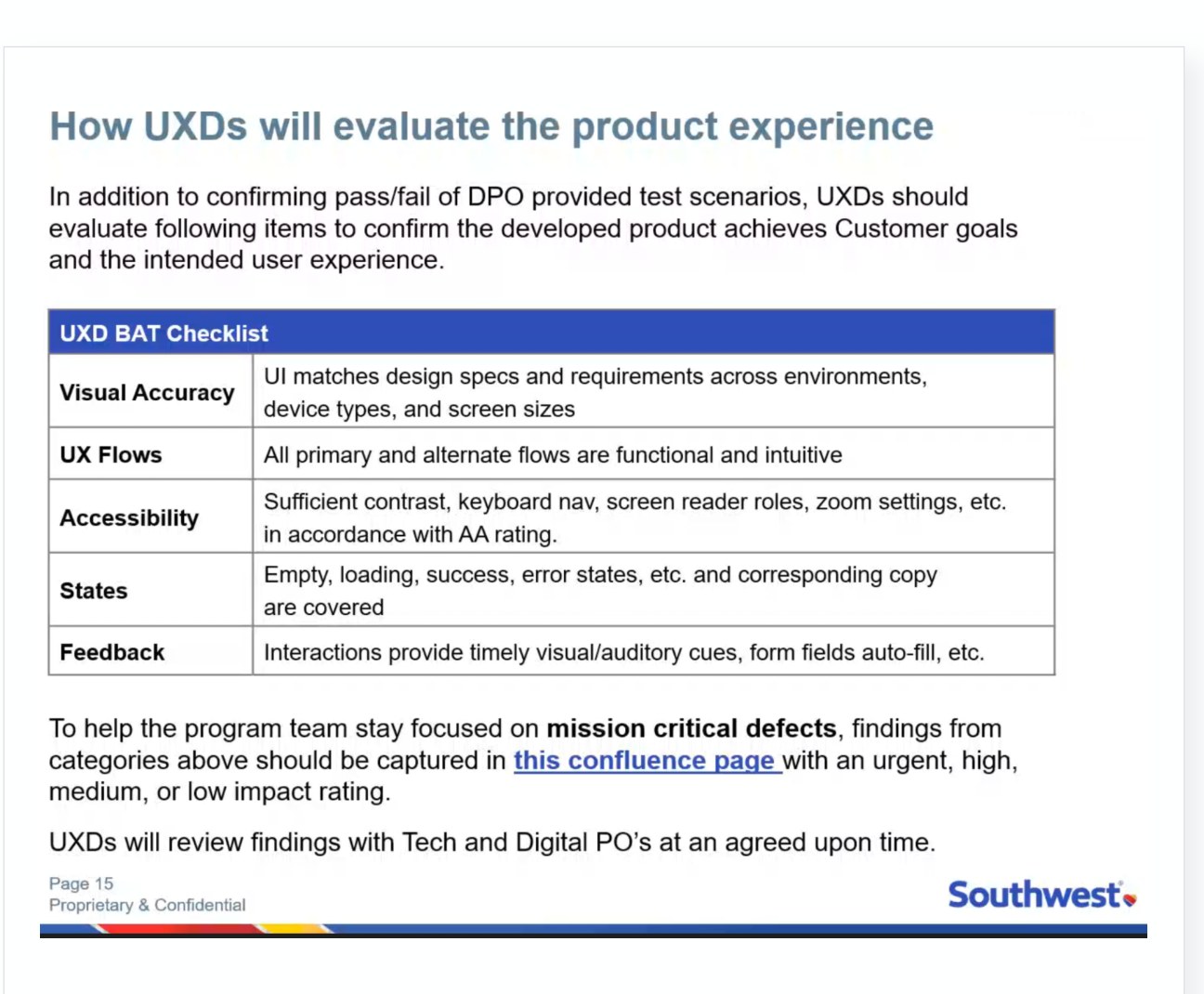
The internal UX team owned Business Acceptance Testing, confirming the developed product matched design intent, until capacity became a constraint. When coverage started slipping, I picked it up hands-on alongside the team — the same direct-ownership model that had structured the project from the start. Over three intensive weeks we identified and corrected the backlog. Unglamorous work, and exactly the kind that separates a project that ships clean from one that ships and needs damage control.
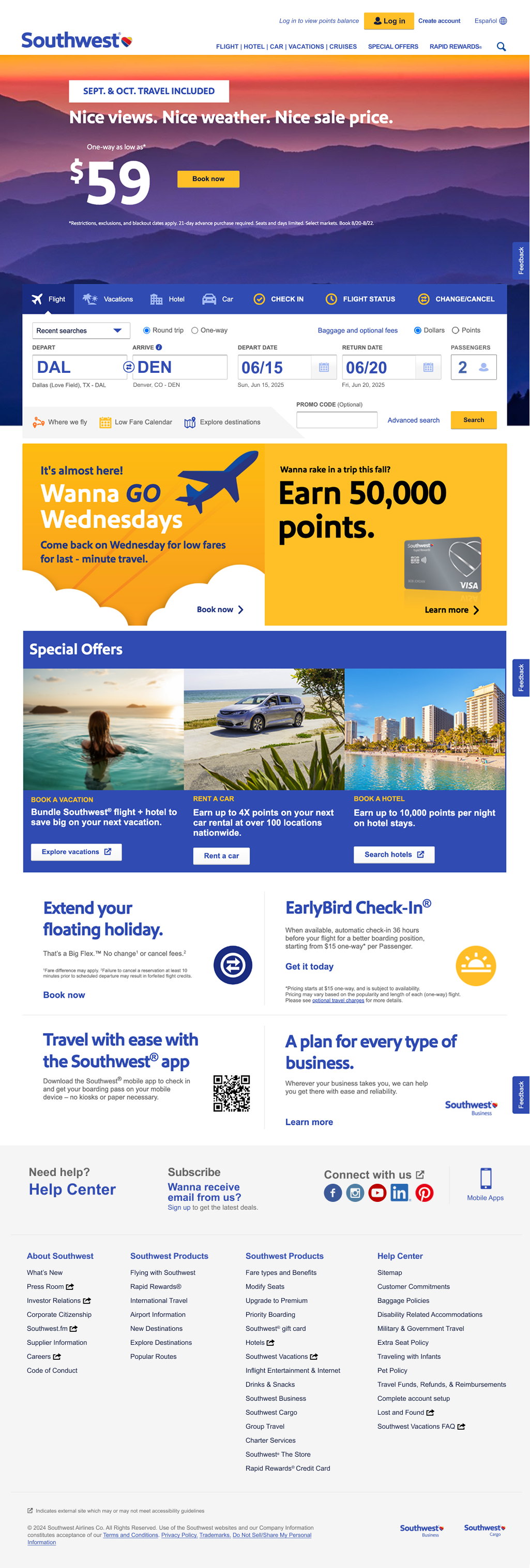
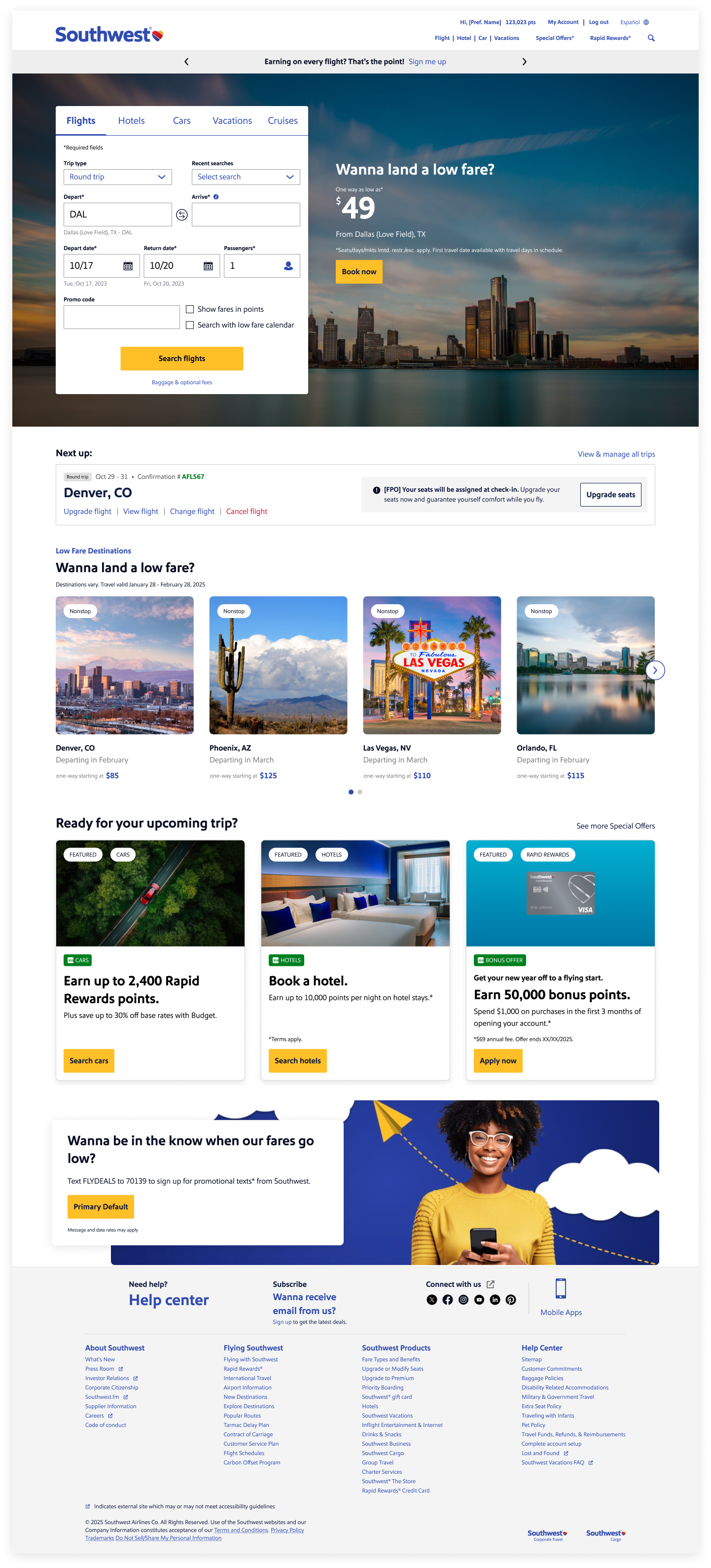
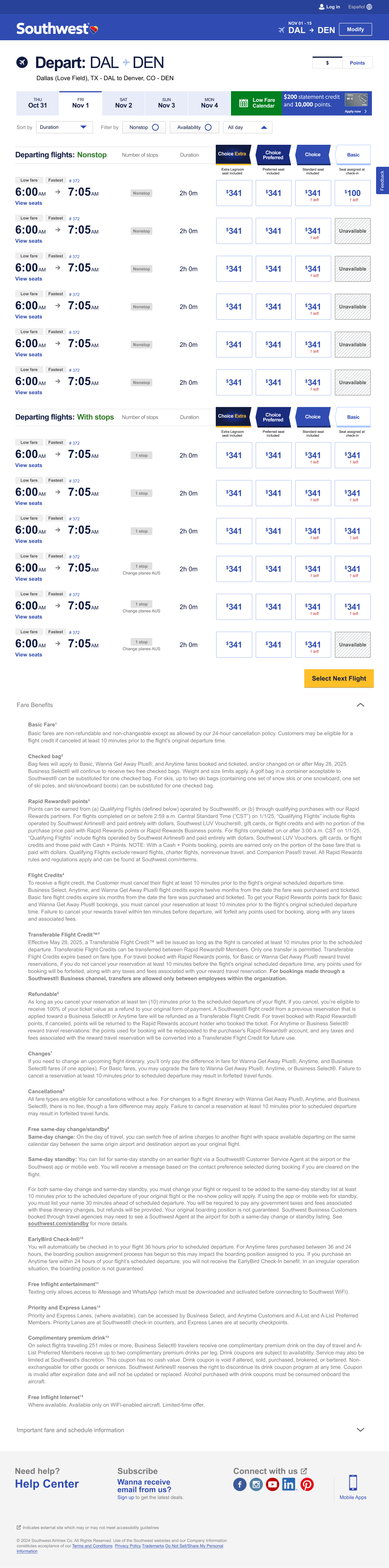
A new seat selection model, a modernized booking funnel, and a consistent look and feel that honored the Southwest brand while moving it decisively forward. These are the full, un-cropped pages — scroll inside each frame, or click through for the full-resolution view.
To make sure the redesign delivered value beyond launch, I partnered with analytics, operations, and customer insights to build a measurement framework across four areas: conversion and engagement tracking through the booking funnel, post-booking NPS at the moment of highest intent, operational signals like boarding time and agent intervention, and continuous-improvement tooling — A/B testing, heatmaps, support ticket tagging — so the product team could keep iterating after we left.
"These strategies should empower Southwest to monitor and optimize the new seat selection experience post-engagement, ensuring the redesign is positioned to deliver measurable improvements aligned with key business objectives."— from the measurement framework handoff
Ending open seating was unpopular with a lot of Southwest's customers, and the rollout has drawn real criticism — some about the feel of the change, some about the new fare tiers. Both are fair. The decision to end open seating and restructure fares wasn't ours to make; it responded to pressures that predated our engagement. Our job was to design the experience customers would actually use once that decision had been made.
That distinction matters, but it isn't a place to hide. What we could control, we controlled well: the flow works across web, iOS, and Android, it handles the full matrix of edge cases on day one, and the BAT work closed the backlog before launch. What I'd do differently — push harder, earlier, for qualitative research with the customers most likely to feel the loss. Not to change the business decision. To shape how it was communicated, and to catch the edges of the experience where sentiment would fray. That part is mine to own.
The redesigned experience went live across web, iOS, and Android — a new seat selection model, a modernized booking funnel, and a measurement framework the product team is still using to keep improving. The design principles the team established became part of the shared language used to make decisions long after the engagement ended.
Continue to the next case study.
→ View naviHealthSquatchbot
Mitch's (slightly hairy) assistant