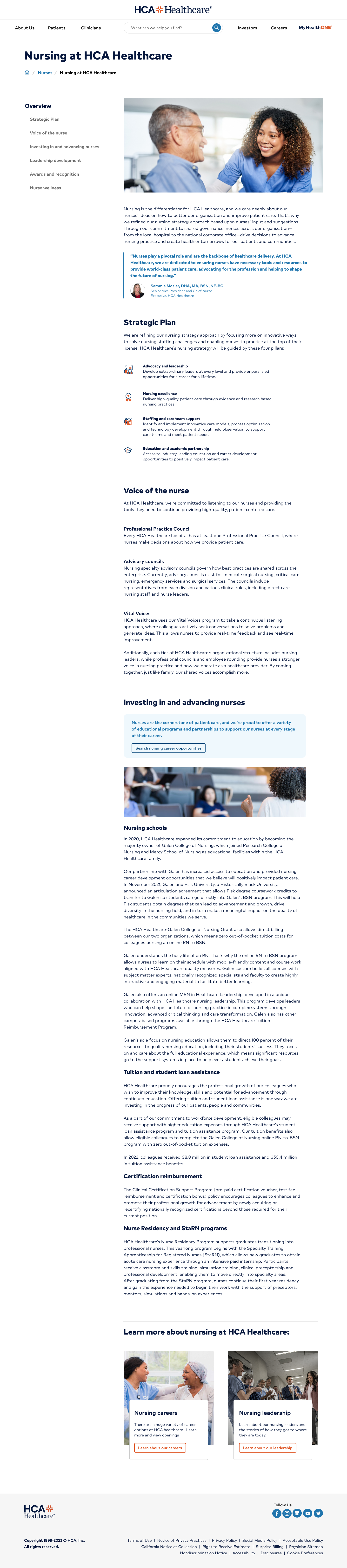
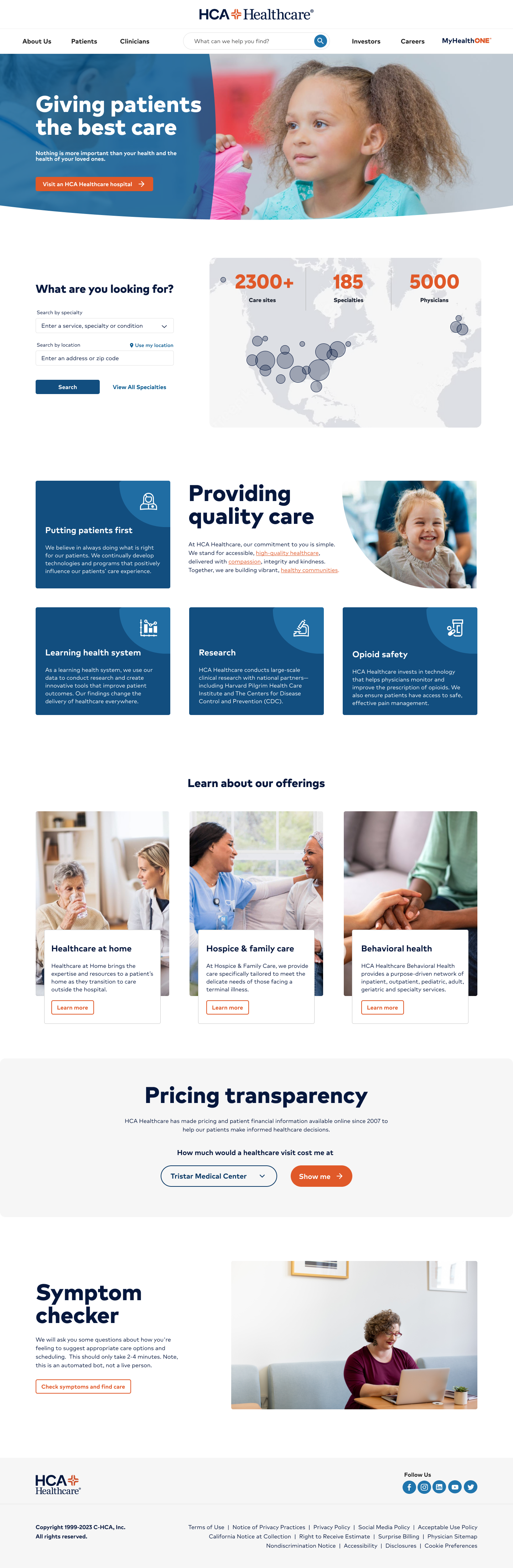
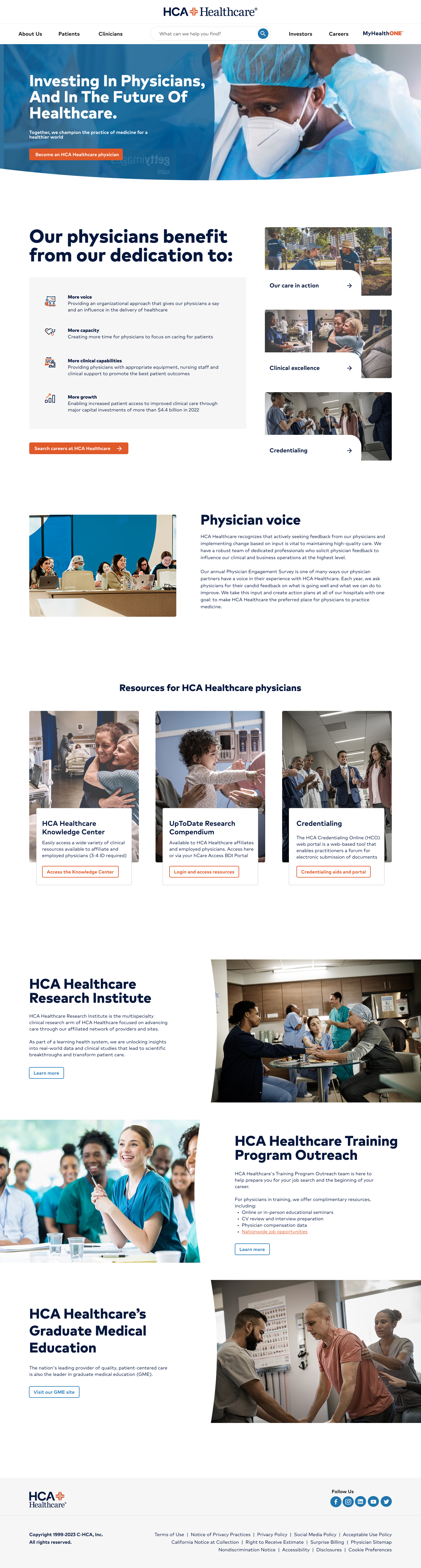
No redesign since 2016. Years of uncoordinated stakeholder edits left a fractured, patchwork site — outdated content, broken navigation, no shared sense of purpose. A platform migration created the forcing function: redesign it, align internally, and build the governance to keep it from fragmenting again.
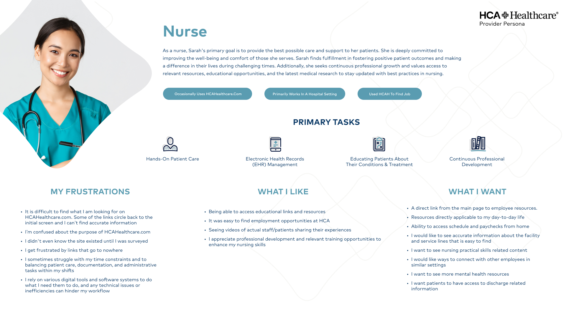
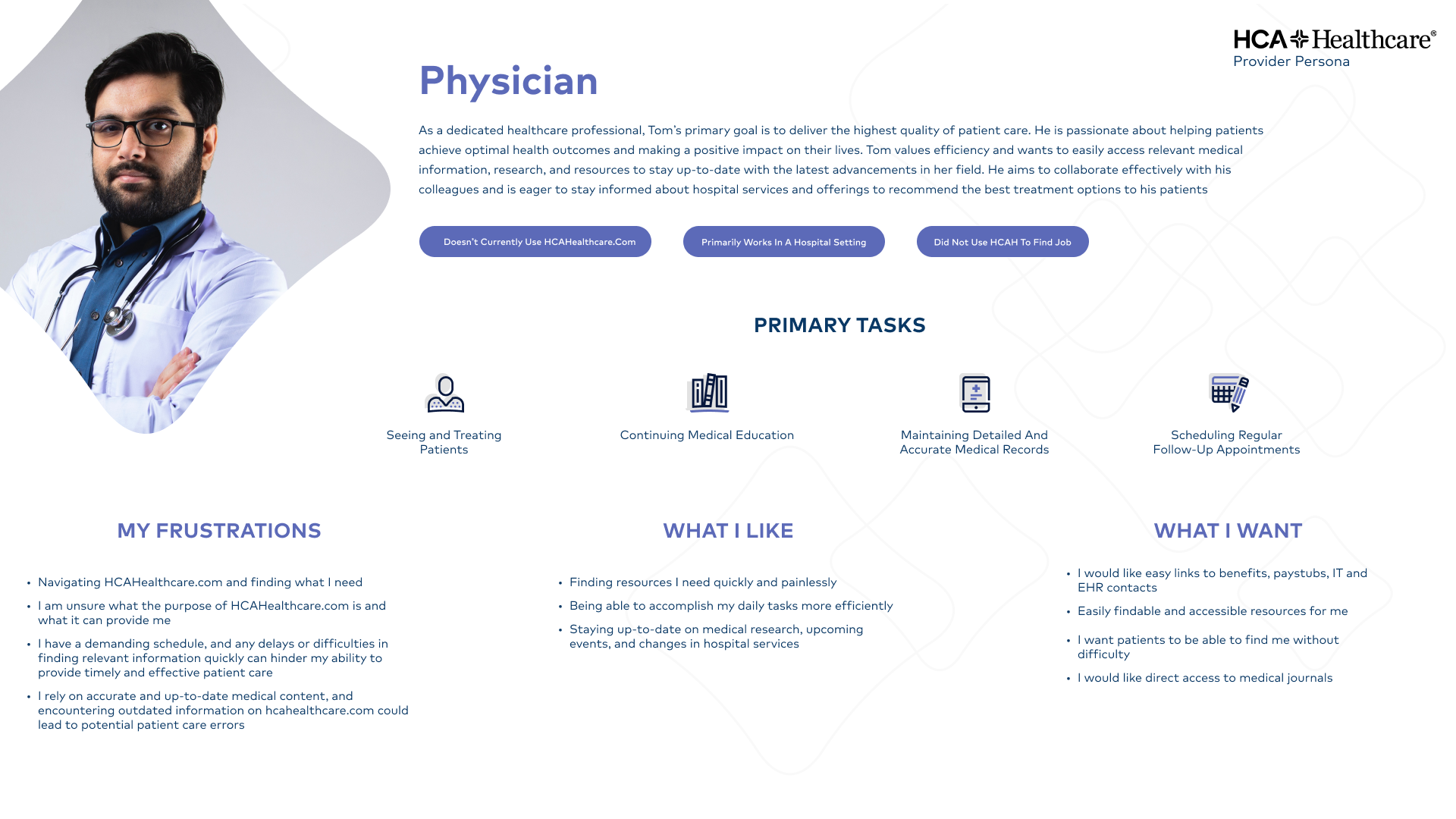
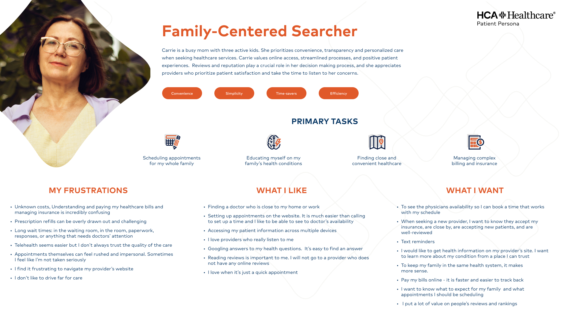
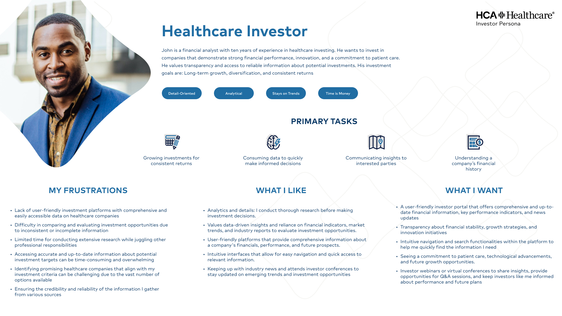
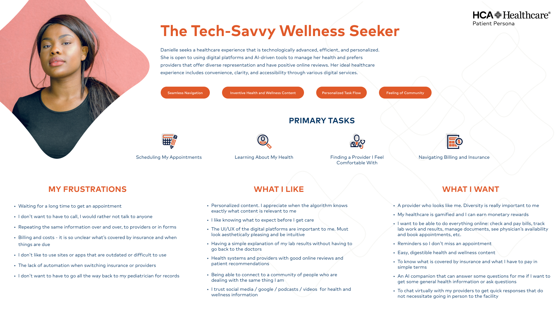
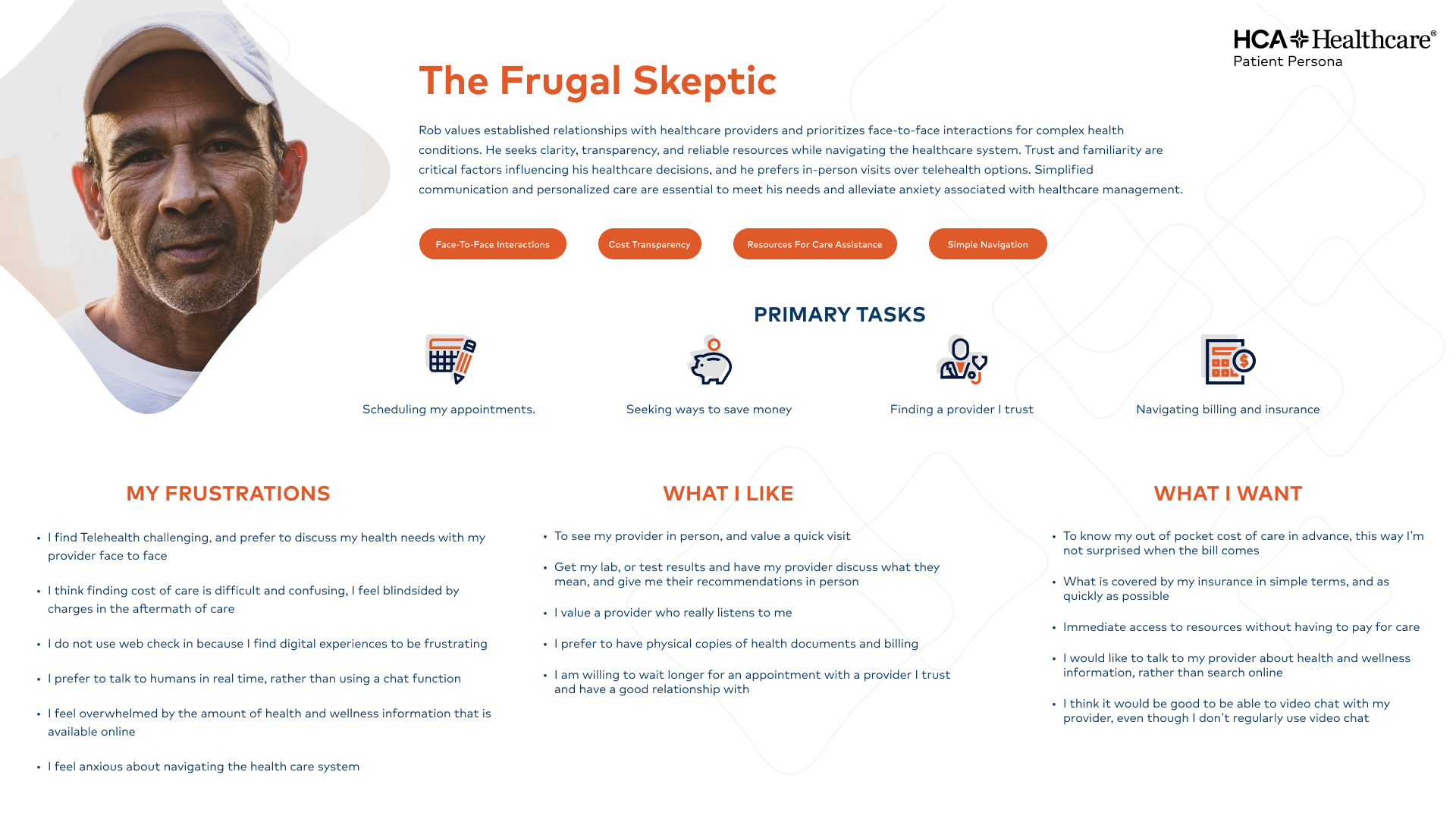
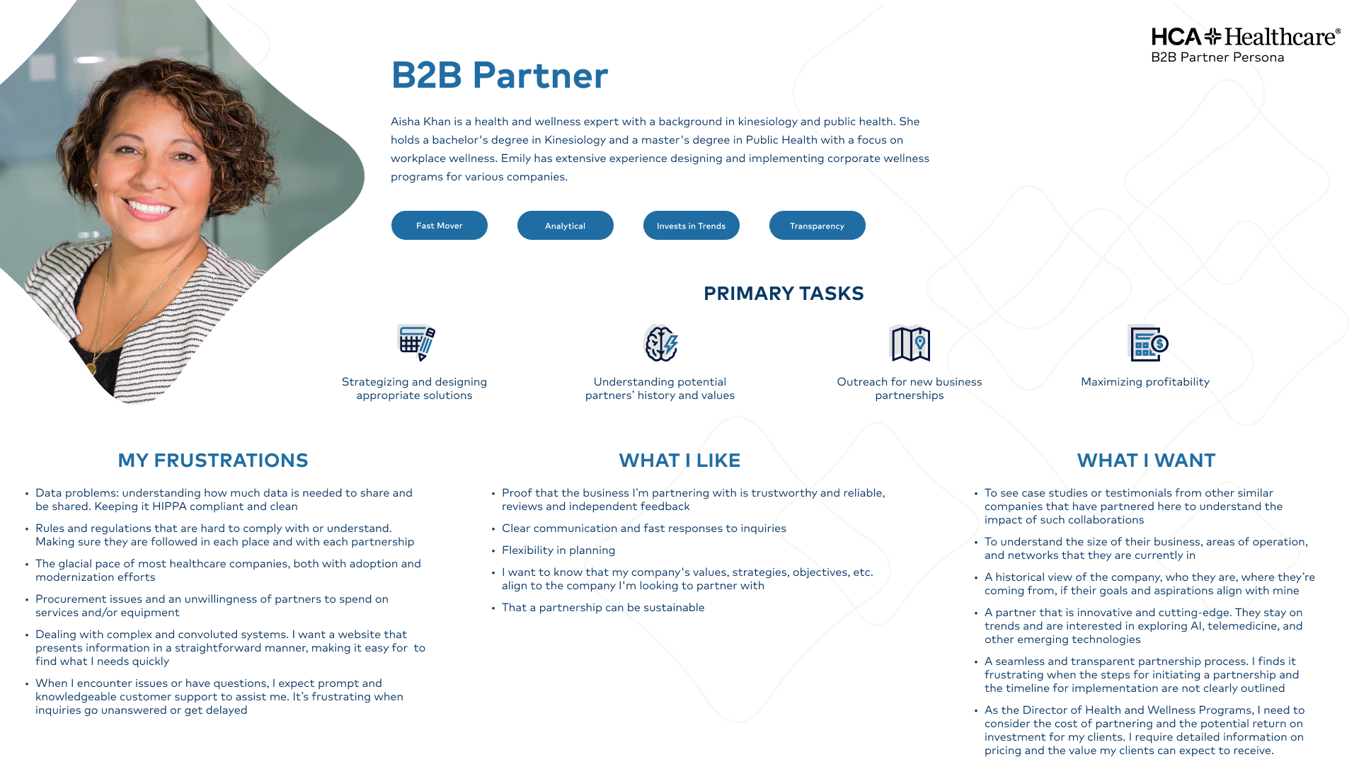
A team of six designers and researchers ran 31 one-on-one interviews with potential patients, reviewed survey responses from more than 70 physicians and nurses, and gathered input from a dozen business leaders and investors — all within a few weeks. Clustering and affinity mapping produced seven grounded personas that gave the whole team a shared language.
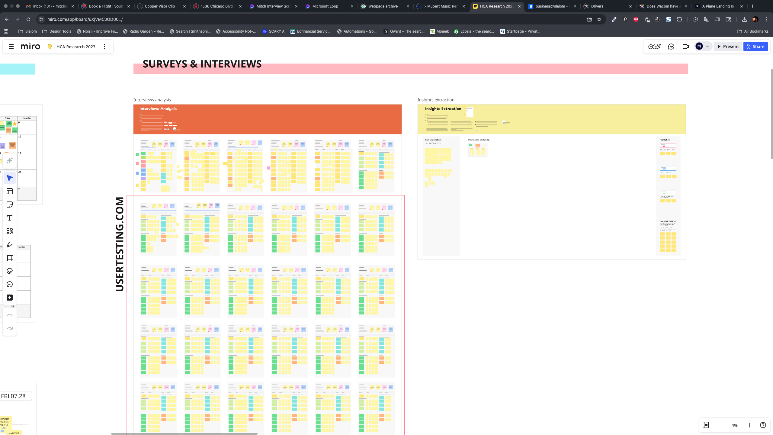
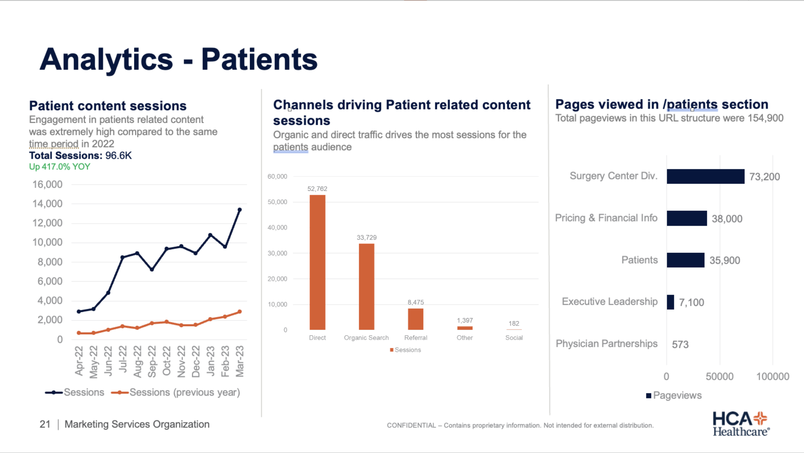
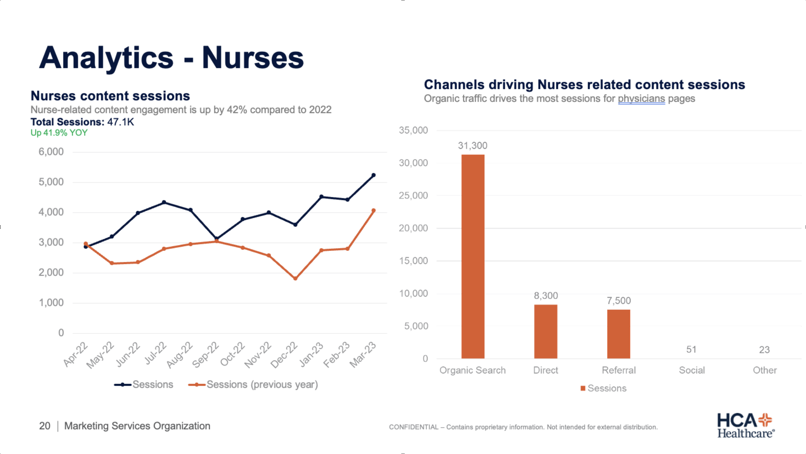
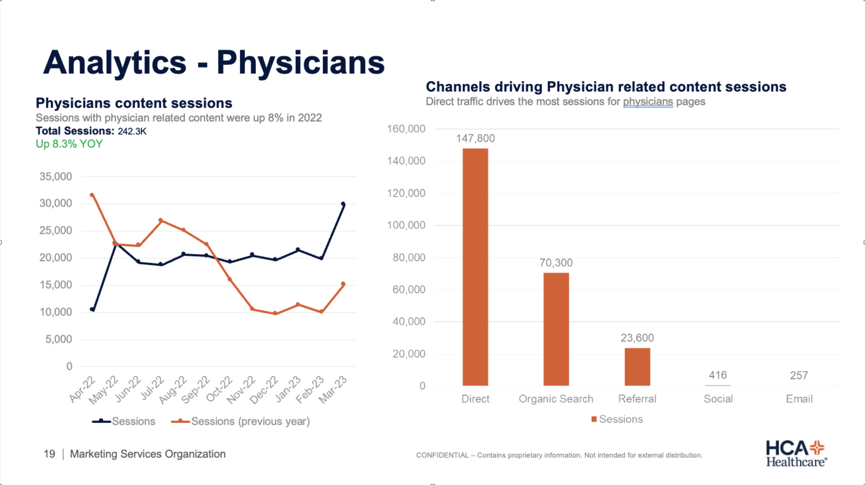
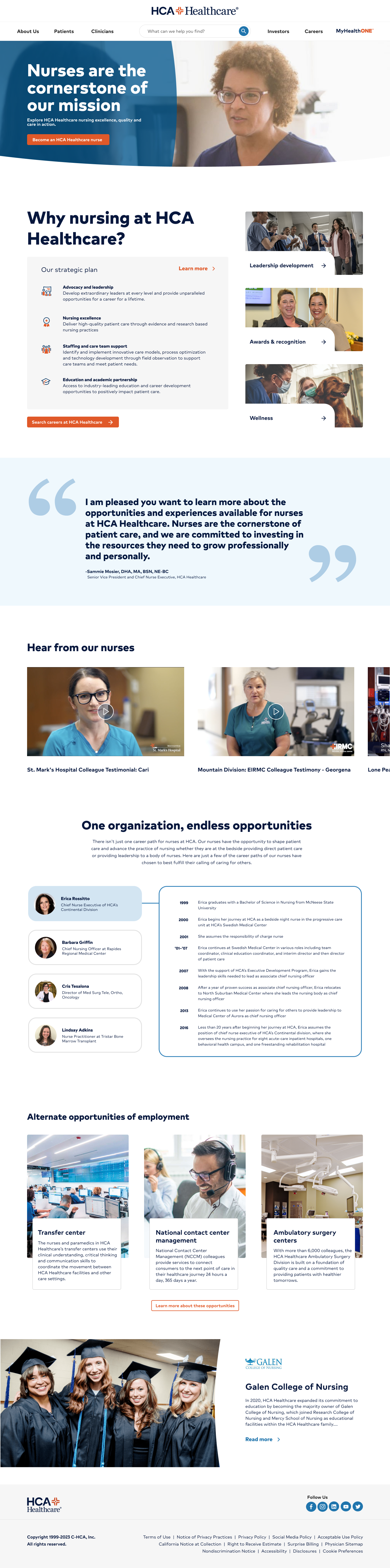
An analytics deep-dive with HCA's Marketing Services team mapped what people were actually looking for and where they dropped off. A substantial share of traffic was people hunting for career content — buried several levels deep. They were finding it despite the site, not because of it. That reframed the whole priority list.
"A substantial share of the site's traffic was people hunting for career content, buried several levels deep. They were finding it despite the site, not because of it."— from the analytics deep-dive
HCA already had an internal UX team, focused on a repeatable design system for a large network of clinics and hospitals. This project sat outside that scope from the start — a public-facing redesign that began as a sales-focused pitch and grew into something that needed real weight once the career-content finding surfaced. Working outside their department made the internal team understandably hesitant to bring an outside consultant in. That changed once we produced working templates that were simply better than what they already had. Once the improvement was visible instead of argued for, the door opened.
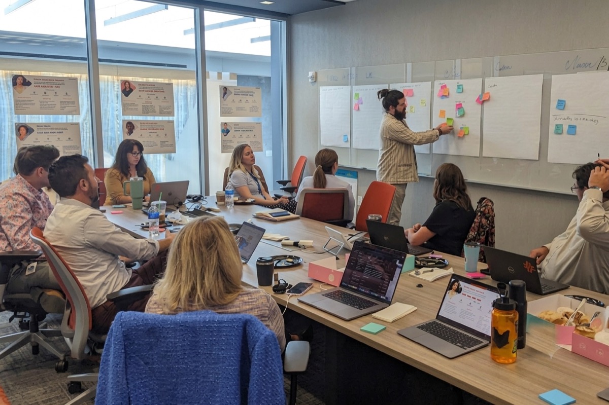
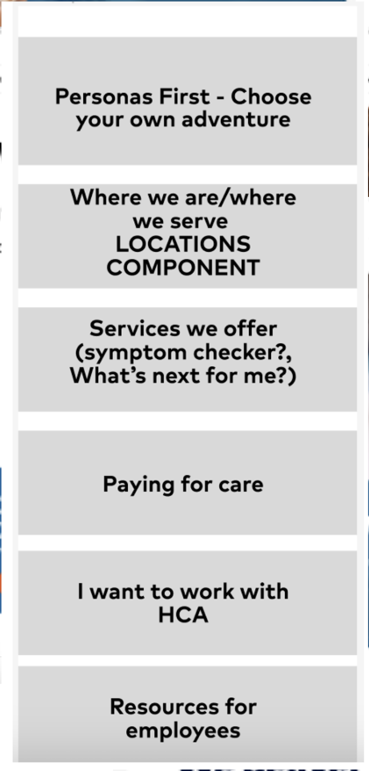
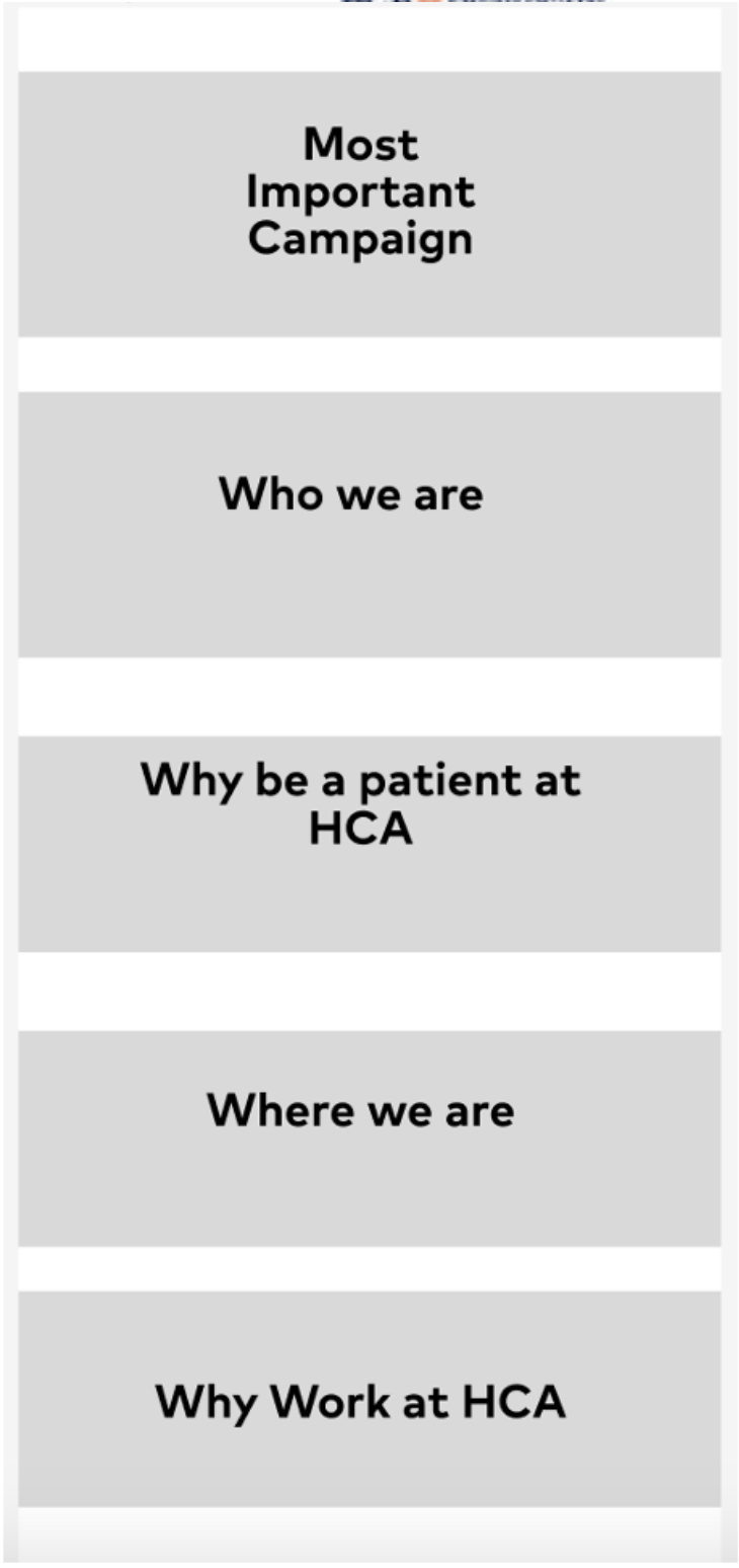
I facilitated a four-hour workshop walking stakeholders through all seven personas, running How Might We exercises against each persona's pain points, then live-sorting the resulting ideas into three buckets — Now, Later, and "someone else's cheese" — with group dot-voting driving the prioritization.
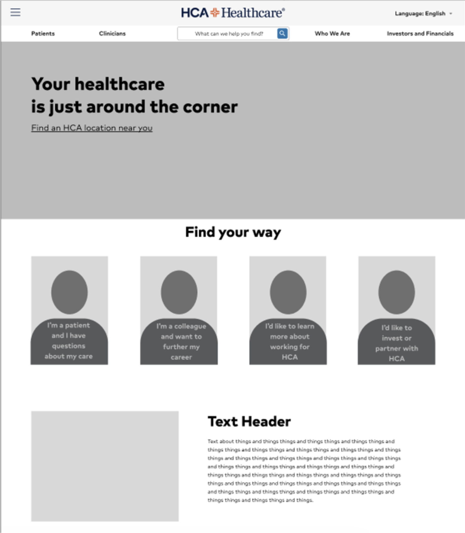
Grounded in the research and guided by the personas, the team produced three distinct directions — low-fi wireframes through mid-fidelity visual explorations — before landing on a serious modernization that stayed inside HCA's style guide.
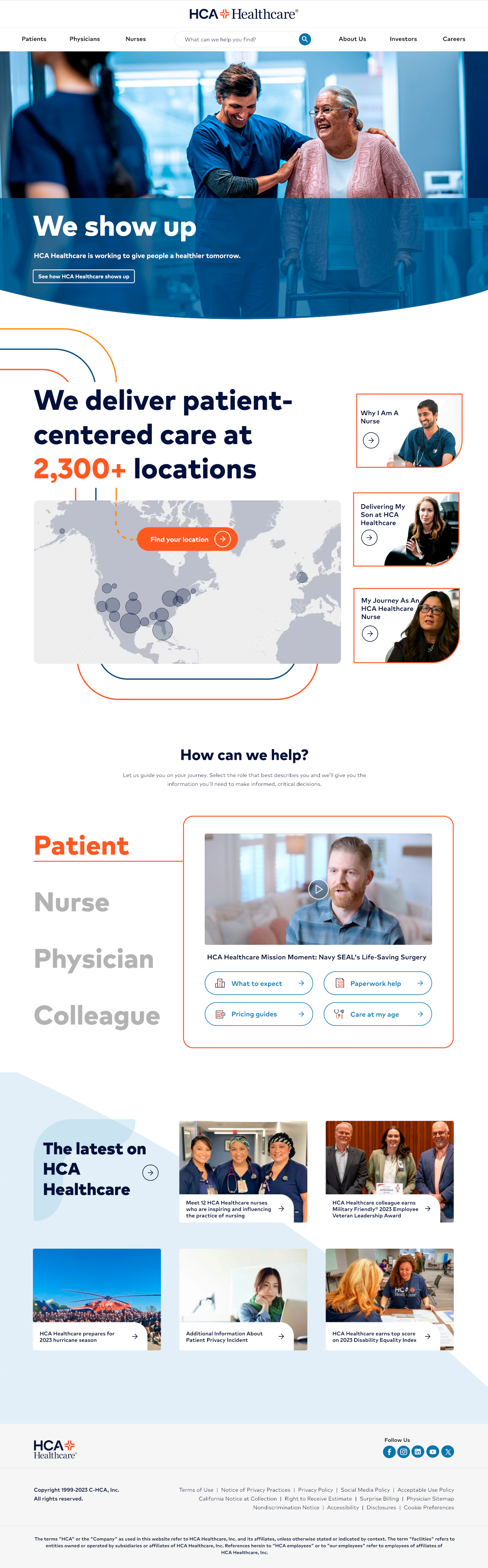
A modernized homepage balancing patient, provider, and investor needs within HCA's existing style guide — a serious step forward that still feels unmistakably HCA.
The project delivered a research-validated, stakeholder-aligned foundation — interactive prototypes, a new IA, and the governance to keep things from fragmenting again. The lasting outcome was bigger: HCA moved from assumption-based web management to evidence-based design. The career-content finding is the clearest example — nobody would have guessed it. It came from data and listening.
Back to Selected Work for the rest of the portfolio.
→ Back to Selected WorkSquatchbot
Mitch's (slightly hairy) assistant