01 BarTrack 02 Nissan 03 Big Tech Client 04 Southwest 05 naviHealth 06 HCA
Case Study 02 — Nissan

Dealer Performance Dashboard for Nissan Aftersales

Client
Nissan North America — Aftersales
Role
Lead UX Designer / Researcher

Field Operations Managers each manage roughly a dozen dealers. Walking into a meeting, they needed to know where a dealer was outperforming or slipping — fast. The existing answer was chasing numbers across multiple Tableau workbooks that didn't match each other.

"It's too many reports with too much information, and none of it seems to match the other reports."
— A former FOM now at Nissan HQ
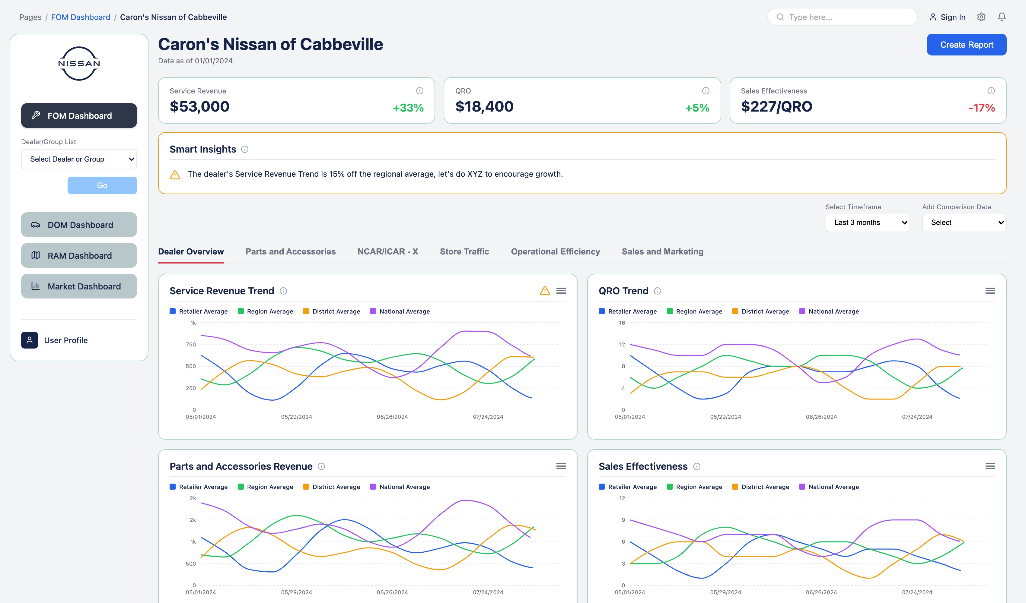
Nissan FOM dashboard dealer scorecard showing Smart Insights and four-way benchmark trend charts
Dealer Scorecard · Retailer, Region, District & National, Benchmarked at Once
Research

21 interviews. One mandate: drive the conversation, don't just report the news.

  • A parallel competitive analysis of financial services, retail field-ops, and manufacturing dashboards
  • The pattern across every strong example: lead with the anomalies, not the totals
"I would love something that didn't just report the news, but actually helped them understand how to have a conversation about how to improve at a dealer." — A former FOM now at Nissan HQ
21
Stakeholder Interviews
Field Operations Managers
Regional & District Leadership
Aftersales Product Owners
Data Engineering
Analytics
Artifact

Organized around how FOMs talk, not how the data was stored.

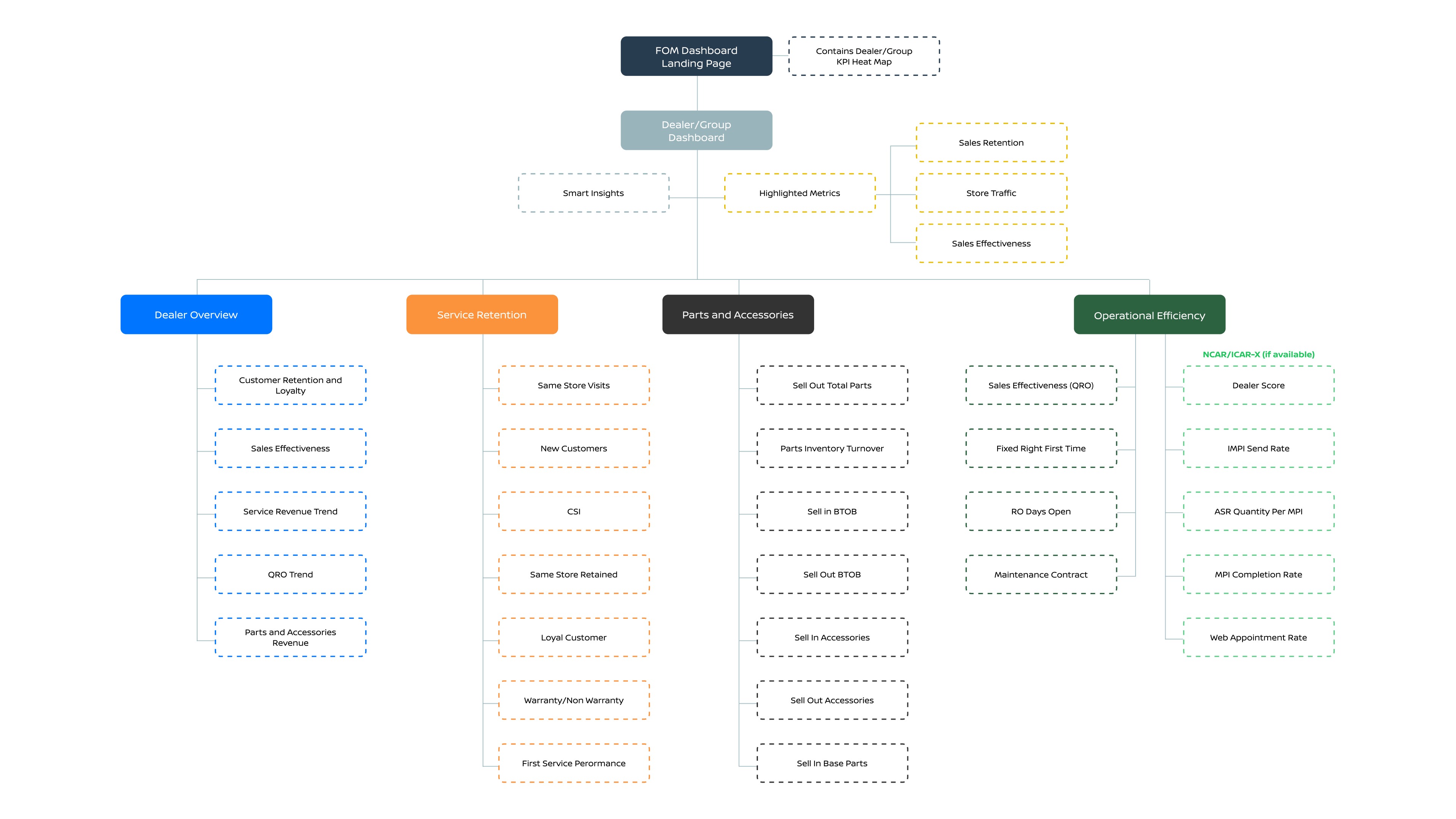
Forty-three candidate metrics came out of stakeholder sessions. Thirty were available without new engineering — that split became the MVP line. Within the 30, an IA exercise clustered them into groups a FOM would actually navigate by: Dealer Overview, Service Retention, Parts & Accessories, Operational Efficiency — and later, Marketing, added after FOMs asked for it.

Nissan dashboard information architecture diagram
Information Architecture · Heat Map → Scorecard → Detail
The Design Decision

FOMs don't browse dashboards. They scan them.

A director's stock-ticker chart became the paradigm — a treemap heat map where each tile is a dealer, sized by revenue and colored red-to-green against benchmark. A click opens a scorecard benchmarked four ways at once: Retailer, Region, District, National. I added a Smart Insights banner to surface the one anomaly worth discussing, but scoped it deliberately narrow. Data engineering flagged that the incoming data was not reliable enough to model predictively yet, and shipping a prediction on top of shaky data would have recreated the exact problem FOMs were already living with — numbers that did not match across reports. I held predictive scoring back until the modeling earned that trust.

Live prototype  ·  click any tile to drill into a dealer scorecard
→ Open full-screen in a new tab
Outcome

A static deliverable, pushed into a working prototype.

The engagement closed with a research-validated design, IA, and roadmap: thirty metrics live now, thirteen more roadmapped, and predictive insights intentionally withheld until data engineering could vouch for the inputs feeding them. After the engagement ended, I rebuilt it as a working AI-assisted React prototype, directing Claude the way I'd direct a developer — design decisions mine, implementation AI-augmented.

30
Metrics Shipped
13 More Roadmapped
Rebuilt as a Working AI-Assisted Prototype
Next

03 — Big Tech Client

Continue to the next case study.

→ View Big Tech Client
Switch Experience
Bauhausian Classic Hacker Neo-Brutalist Punk Zine