01 BarTrack 02 Nissan 03 Big Tech Client 04 Southwest 05 naviHealth 06 HCA
Case Study 05 — naviHealth

Patient Transition Suite for naviHealth

Client
naviHealth
Role
Design Lead / Evangelist

Meet Mr. Ouch. He's a patient, but he's also your parent, your grandparent, or just someone tired and hurting who wants to get discharged home.

A discharge decision has real money and real health riding on it. Send Mr. Ouch home too soon and he can land back in the hospital, sicker and now more expensive to treat. Keeping him too long carries its own risk: hospitals need the bed back, and a longer stay means more exposure to complications he would not have faced at home. It takes a team of well orchestrated professionals — doctors, nurses, therapists, and care coordinators — to run these checks, and naviHealth's software was supposed to help them do it well. When it slowed them down instead, decisions got made late or without enough information behind them, and ultimately people like Mr. Ouch suffered.

Mr. Ouch illustration — the elderly patient at the center of the naviHealth care journey
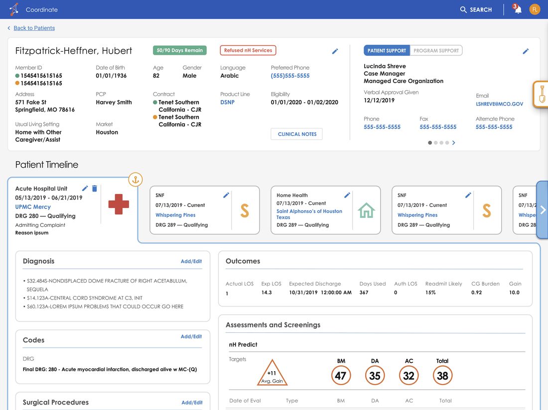
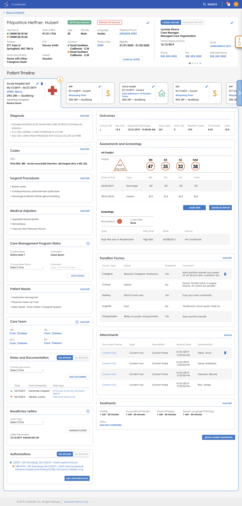
naviHealth redesigned Coordinate patient page
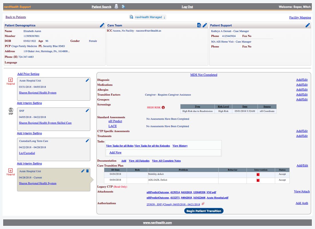
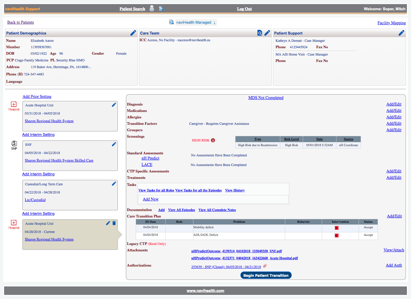
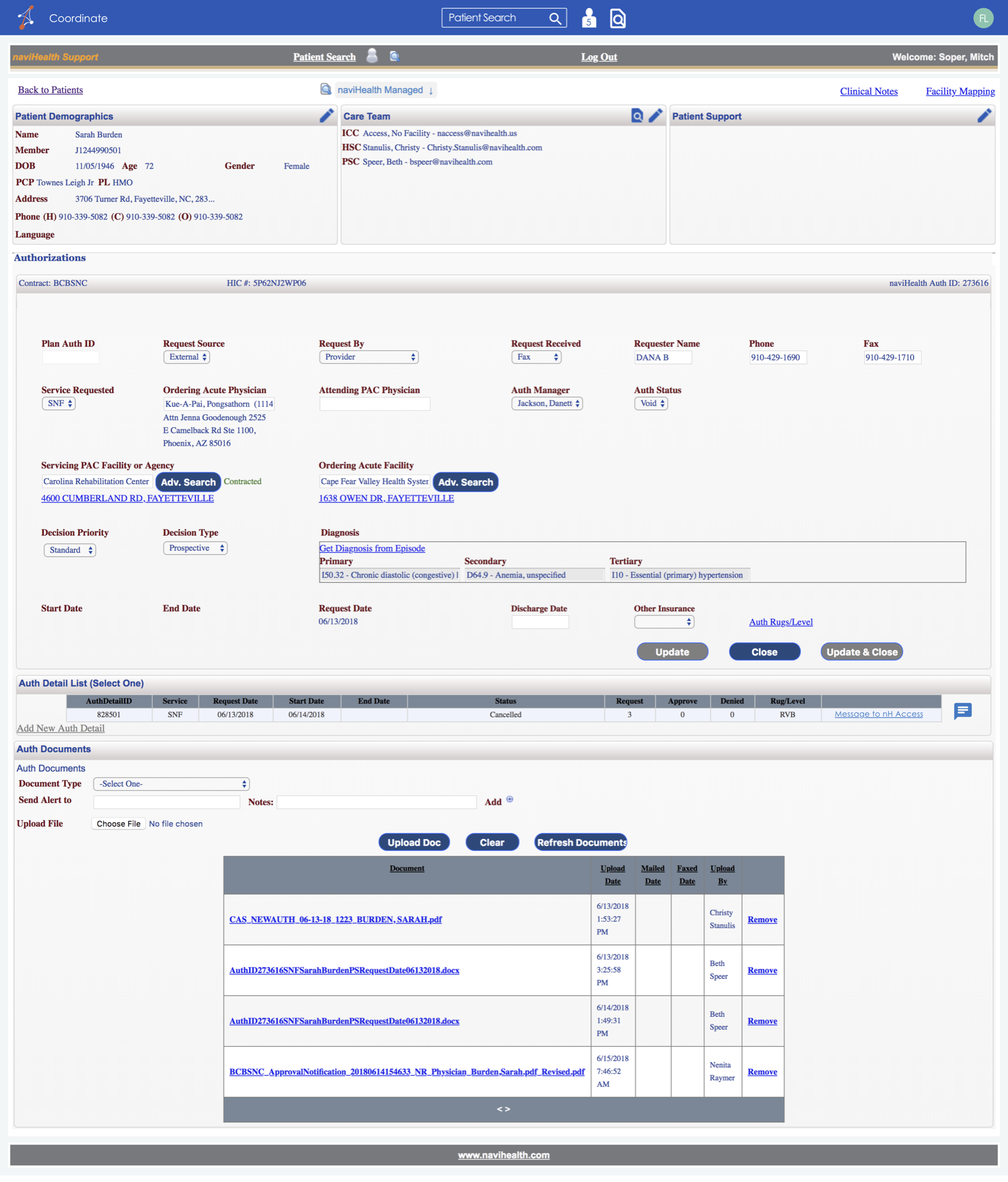
naviHealth legacy Coordinate patient page
Before After
← drag to compare →
Research

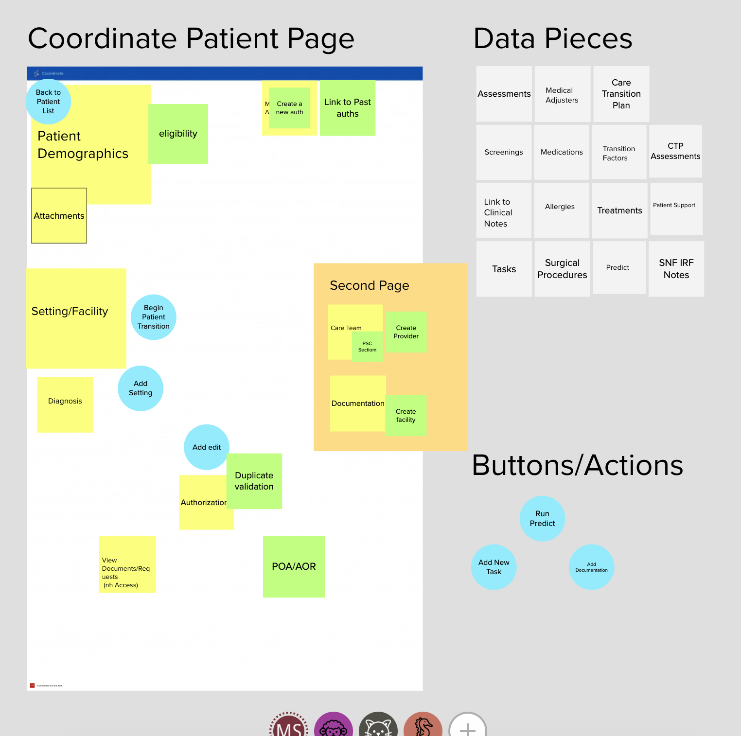
Card sorting, discovery workshops, and a role-based pitch nobody asked for.

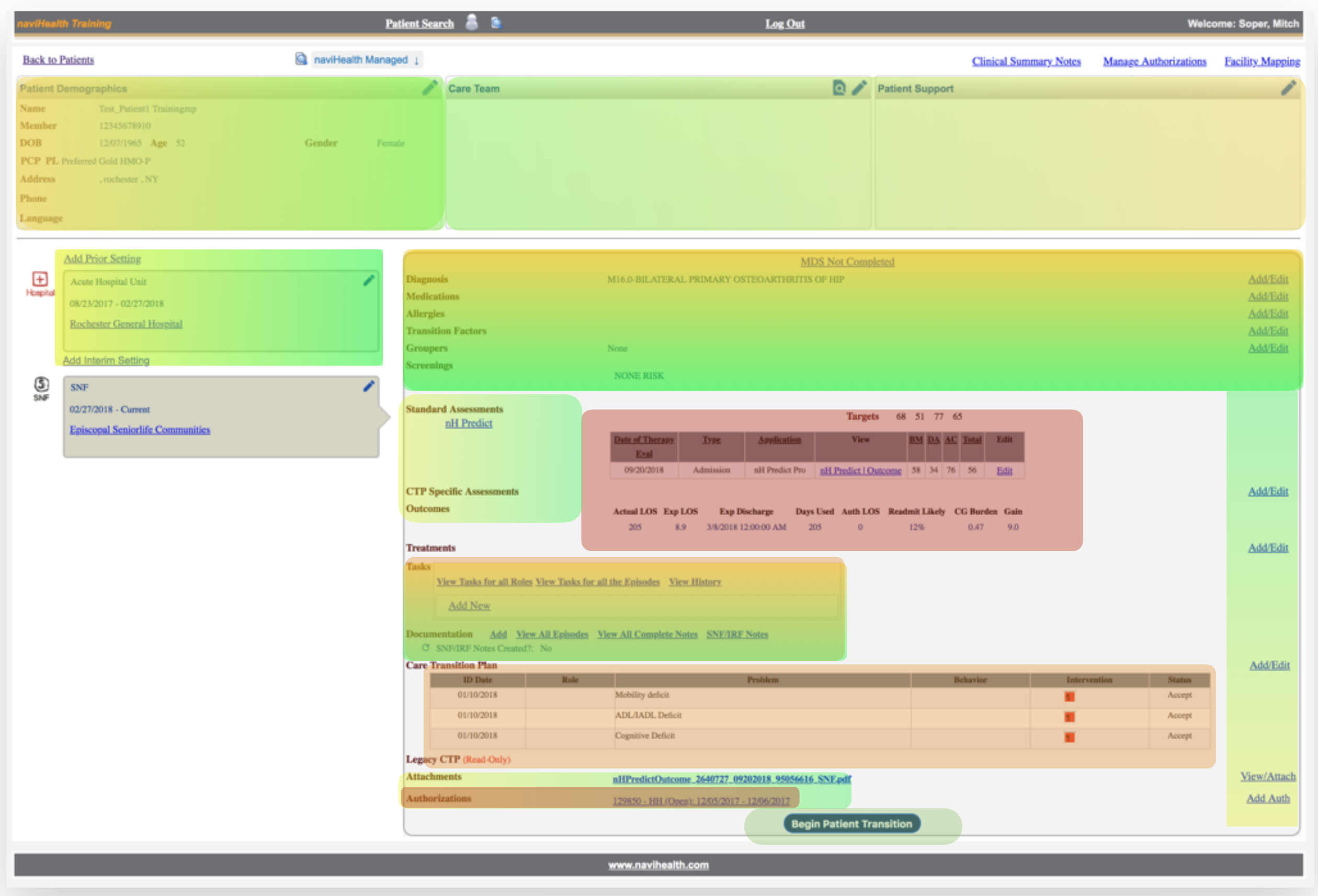
The original ask was a "lift and shift," a facelift with no structural change underneath — the kind of ask that assumes UX means visual treatment and nothing more. This was my first major engagement at naviHealth, and I used it to set the tone for how I'd work with their engineering team going forward: UX needed a real say in how the system worked, not just how it looked. The legacy screen backed that argument up. It was still carrying fields and steps left over from contract requirements that had expired years earlier — dead weight nobody had gone back and cleared out — and it forced very different jobs through the same screen, a field nurse and a centralized data-entry specialist staring at identical layouts to do work that had almost nothing in common. A facelift would have just repainted both problems.

naviHealth legacy Coordinate patient page, dense and dated
The Starting Point · Legacy Coordinate Interface
naviHealth card sorting research session mapping data against user roles
Research · Card Sort & Data Mapping
"After years of piecemeal additions driven by shifting business priorities, Coordinate had become a Swiss Army knife — a tool that tried to do everything, and did none of it particularly well."
— on the legacy interface
naviHealth eye tracking heatmap and information architecture analysis over the legacy interface
Artifact · Eye Tracking & IA Analysis
Artifact

Reorganizing around the F-Pattern, not the database.

The legacy layout forced an inefficient, non-linear scan just to complete basic tasks. I mapped the data users needed most against the F-Pattern — the natural eye-tracking path people take through dense interfaces — and used it to put the right data in the right place and cut cognitive load.

Approach

Staying lo-fi on purpose.

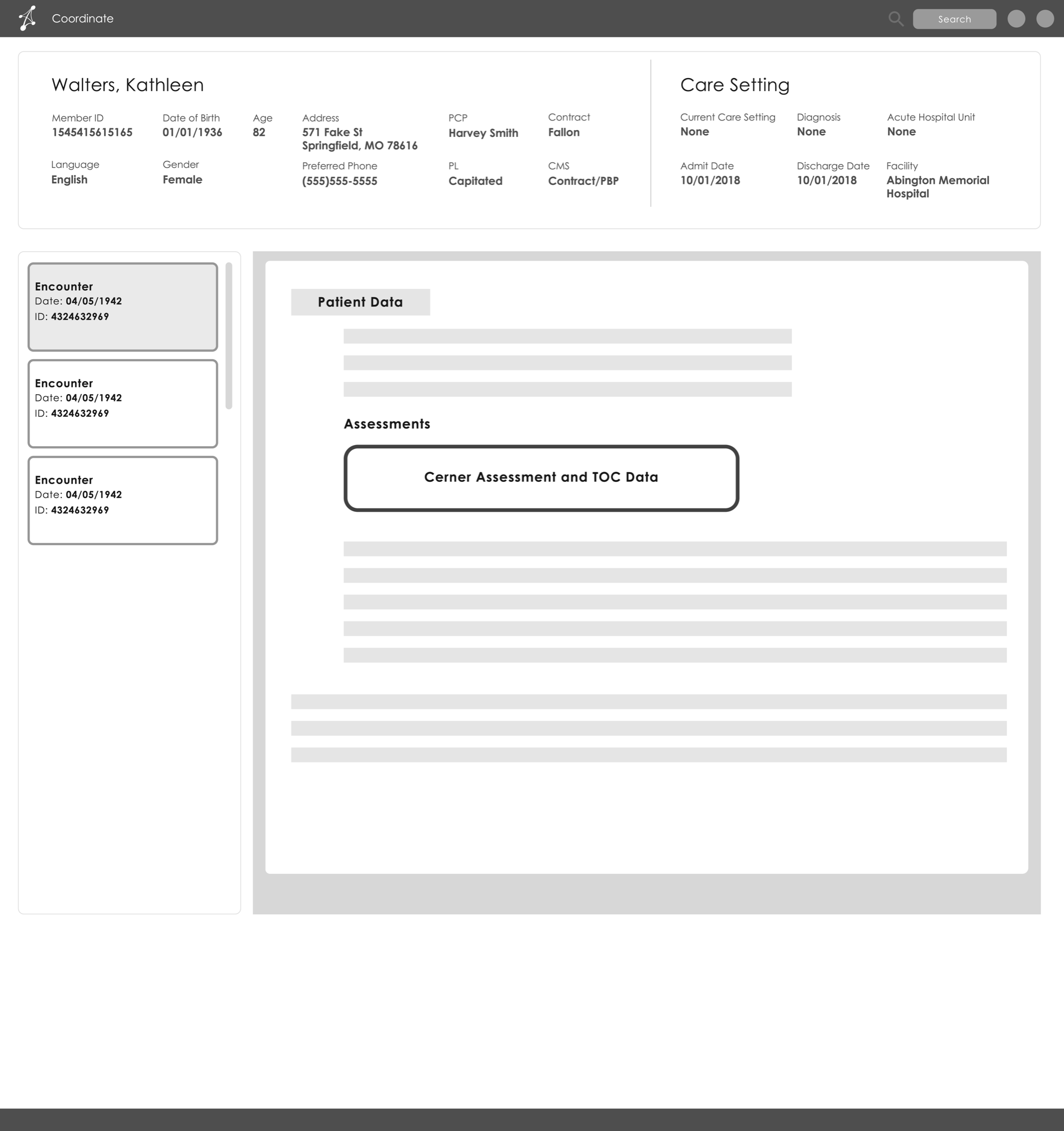
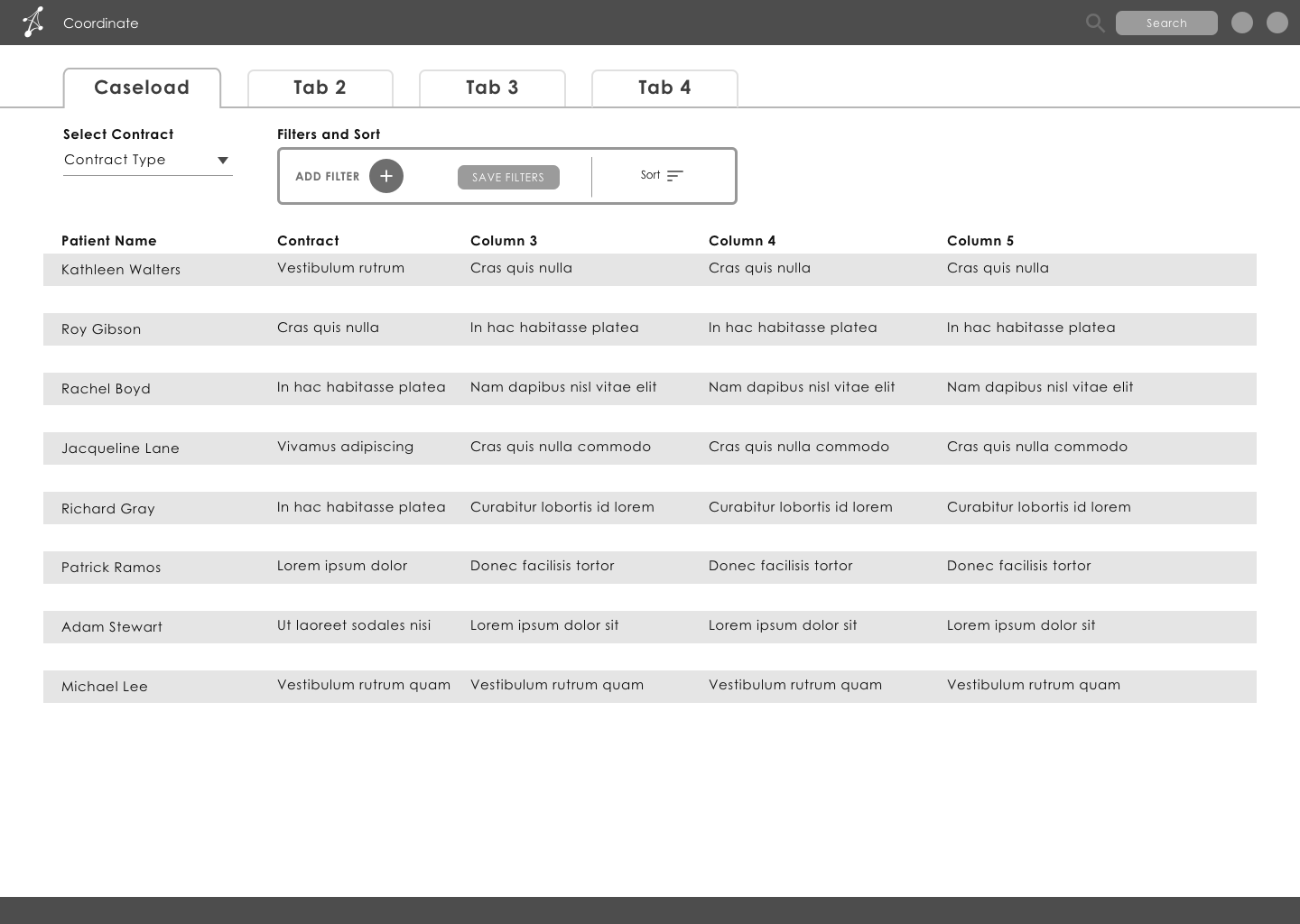
Low-fidelity wireframes kept users focused on layout and interaction, not visual polish still being developed in parallel — letting people give honest feedback on structure without the distraction of aesthetics. Testing surfaced real efficiencies, like re-sequencing tasks to cut extraneous clicks — observations from the people doing the work, not designer opinions.

naviHealth patient page wireframe, low-fidelity
scroll for more ↕
Wireframe · Patient Page Redesign
naviHealth caseload dashboard wireframe, low-fidelity
scroll for more ↕
Wireframe · Caseload View
The Redesign

Reorganized around clinical workflow, not the database.

Patient demographics surfaced at a glance in the header. Care settings and clinical assessments were prioritized by hierarchy. Authorizations, tasks, and documentation were reordered to match real clinical workflow rather than the underlying data model.

+14%
Satisfaction & Retention
+33%
Speed to Task Completion
+17%
Accuracy
Full redesigned naviHealth Coordinate patient page
scroll for more ↕
Redesign · Full Coordinate Patient Page
Redesigned naviHealth assessments and care transition plan sections
scroll for more ↕
Redesign · Assessments & Care Transition Plan
Outcome

From an addendum to an integral part of product direction.

That argument won, and it set the terms for the rest of the engagement. A user-centered approach increased trust in UX from both Product and Engineering, and by the time I left, the UX team was helping define product direction, not called in afterward to supply visual polish. Mr. Ouch still had a long road between the hospital bed and home — but the people helping him get there finally had software that worked with them, not against them.

Next

06 — HCA Healthcare

Continue to the next case study.

→ View HCA Healthcare
Switch Experience
Bauhausian Classic Hacker Neo-Brutalist Punk Zine