01 / 00
← → arrow keys to navigate
Portfolio

Selected Work

Use ← → arrow keys (or swipe on mobile) to move through each case study, or jump straight to one below.

Case Study 01 — BarTrack × NuCO2

A New Market Pivot: IoT Monitoring for NuCO2's National Retail Footprint

Client
NuCO2 × BarTrack — via Scenic West
Role
Lead Product Designer, 0→1

BarTrack's core product monitors beer taps for bars. The NuCO2 partnership is a bet on much bigger territory — CO2 and soda equipment behind thousands of retail locations, starting with 7-Eleven, Whataburger, and Arby's. I was brought on as the sole product designer to turn that bet into a buildable platform: running the stakeholder sessions, designing all four personas end-to-end, and building AI-assisted dev ready prototypes.

"A manager doesn't know if they need to call the CO2 supplier, equipment repair, or Coca-Cola — and calling the wrong one wastes a full day."
— from field stress-testing sessions
Approach

Built with operators, not for them — one stress-tested revision at a time.

  • Weekly working sessions with NuCO2 operations, engineering, and field leadership — specs rewritten three times (v1 → v3) as real pushback surfaced what the first draft got wrong
  • Every story format-checked against how installs, dispatch, and store operations actually run, not how the org chart is drawn
"The sensors-reporting check isn't a suggestion — it's a gate. A tech doesn't leave until the system confirms it." — stress-test decision, confirmed by field ops
4
Personas Designed End-to-End
Field / Installer Technician
Store Manager
Regional & Corporate Ops
NuCO2 Admin & Dispatch
Artifact — Working Sessions

Past the whiteboard: structured, editable flows built in days, not weeks.

Instead of static decks or free-form whiteboarding, I built each persona's flow as a rapidly-assembled interactive tool — drag steps between phases, double-click any card to edit, tag it MVP / integration point / open question. Built in Claude from interview notes and best-guess assumptions, then corrected live in the room. It turned alignment meetings into working sessions: NuCO2 and BarTrack could argue about a specific card instead of a vague impression, and open questions got tracked as data instead of getting lost after the call ended.

→ Open the interactive flow tool
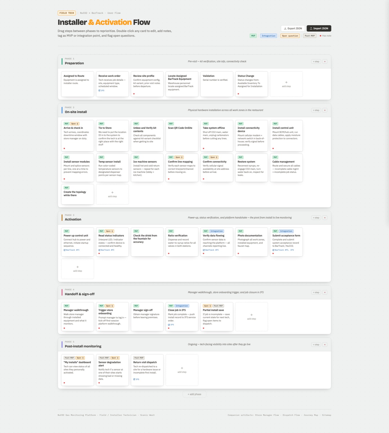
BarTrack installer and activation flow tool with editable, taggable steps across five phases
Installer & Activation Flow · Editable, Taggable, Built for the Room
Artifact — System View

Every touchpoint mapped against the system running underneath it.

A full service blueprint threaded the store manager's experience — onboarding through alert response through resolution — against three backstage lanes: the BarTrack platform, the "BarTrack system" lane (labeled explicitly as the sensors & AI detection engine reading pressure and pour data in real time), and NuCO2's own dispatch systems. Naming that sensor/AI layer explicitly — instead of leaving it implied — kept the team honest in reviews about what was actually automated versus what only looked automated from the front end.

→ Open the interactive blueprint
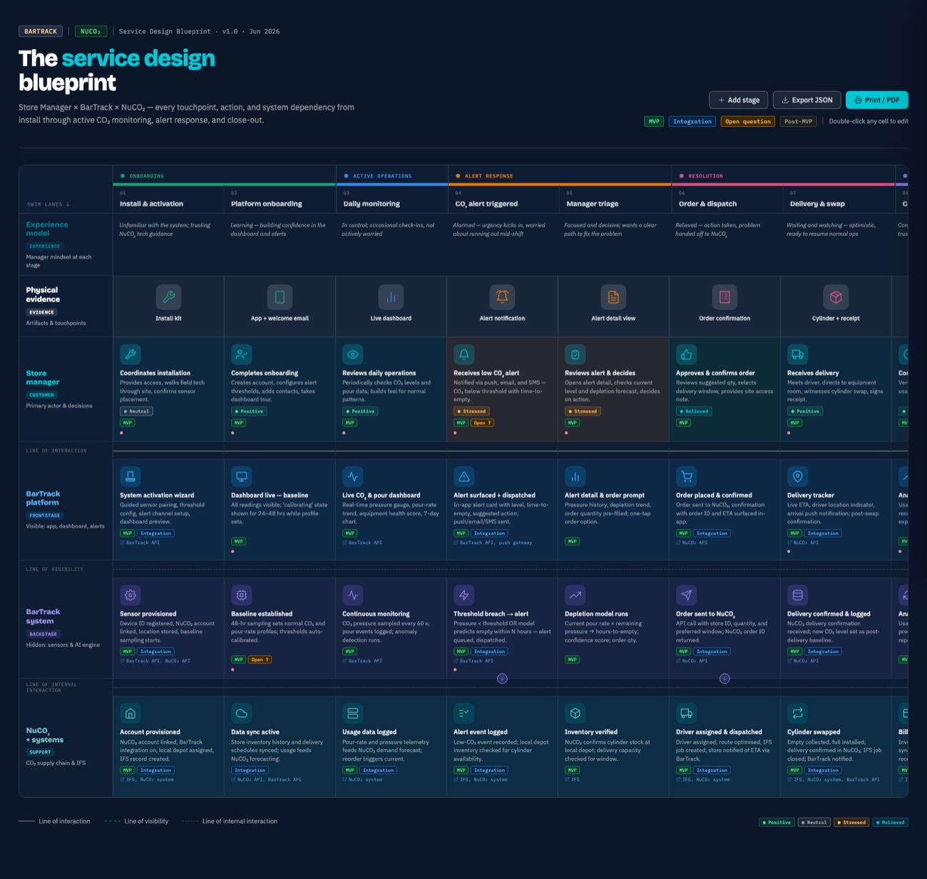
BarTrack x NuCO2 service design blueprint across onboarding, monitoring, alert response, and resolution
Service Blueprint · Store Manager Journey, Front Stage to Backstage
The Design Decision

Regional visibility, designed to read as protection, not surveillance.

Corporate wanted fleet-wide uptime visibility; in stress-test sessions, store managers pushed back that real-time alerts to corporate would read as discipline, not support. The design resolution: a grace-period model — local resolution gets a window before anything escalates upward — paired with a regional view that frames downtime in dollars protected, not violations logged. The same reframe carried into alerting generally: NuCO2 dispatch gets every alert at the same moment the store manager does, so the store manager's screen had to answer a different question than "what's broken" — it had to answer "is this already being handled, and what do I need to do locally."

→ Open the live map — zoom in, click a store
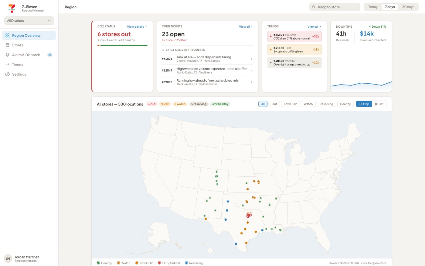
BarTrack regional manager dashboard showing CO2 status, open tickets, and fleet map across 500 locations
Regional Manager · Real Map, Zoomable, Click a Store to Drill In
The Design Decision

A region to protect. A store to run. Same platform, two different jobs.

The regional dashboard is a scan-and-triage tool — a fleet of hundreds reduced to what needs attention. A single store manager needed the opposite: depth on the one location they're standing in. Tank-by-tank CO2 levels by zone, syrup levels per flavor, per-station dispensing detail, a 30-day supply forecast, one-tap early reorder when the math doesn't work out — built phone-first, for someone checking between customers, not sitting at a desk. High-turnover store staff also weren't going to create accounts and remember passwords for a screen they'd open twice a shift, so access is QR-first: scan, see live status, no login required.

A separate, smaller ask came from NuCO2 itself: their own admin/ops team needed visibility that nothing on the BarTrack side was falling through the cracks — flagged jobs, onboarding status, tech support queue. That got a lightweight console of its own, not the focus of this case study.

→ Open the interactive store manager prototype
AI-Forward Execution

The hardest UX problem got an AI-assisted answer, prototyped in-tool.

The #1 identified challenge was topology mapping — tying each physical dispenser line to the right sensor during install, entirely by hand today. I designed and prototyped a computer-vision "scan & auto-map" flow directly in Figma Make: point the camera at the fountain, the AI reads each label and proposes a mapping with a confidence score per line, and a technician corrects anything it got wrong before confirming — with a full manual-entry fallback for when the scan doesn't hold at all. Live demo on the right: select sodas, scan, watch it map all 8 stations.

→ Open full-screen in a new tab
From Comps to Code

A separate call: prototype in the real stack, not just in Figma.
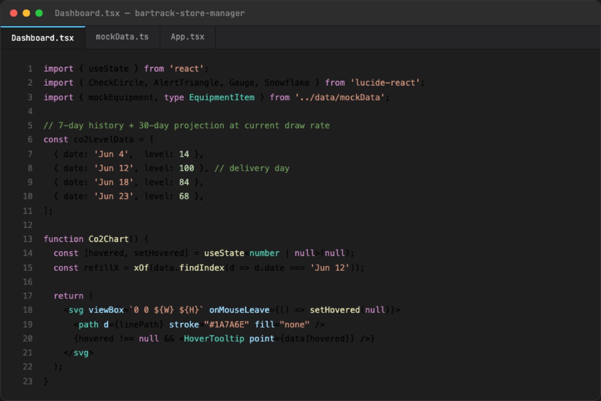
Once the direction was validated, I made a second, distinct decision with BarTrack's dev lead: move key flows out of static comps and into working React / Tailwind / shadcn prototypes, directing Claude Code the way you'd direct an engineer — design decisions mine, implementation AI-augmented. The goal was both a visual polish that held up to real scrutiny, and interactions that actually worked — nailing down real state and edge cases (partial installs, offline queueing, dormant-device activation) before engineering picked it up, so the spec they inherited had already survived contact with a real codebase.
Code view of the BarTrack store manager React prototype, showing the CO2 forecast chart component
Source · CO2 Forecast Chart Component, React + TypeScript
Outcome

A stress-tested backlog, handed to engineering as spec — not a deck.

The engagement closed with a research-validated backlog across four personas, a full service blueprint, interactive working-session flows, and AI-assisted working prototypes — the foundation NuCO2 and BarTrack are now building from as the platform moves from spec into engineering, and BarTrack's opening claim on a new market.

0
Personas Designed End-to-End
0
User Stories Specced & Stress-Tested
0
Weeks, Kickoff to Handoff
Case Study 02 — Nissan

Dealer Performance Dashboard for Nissan Aftersales

Client
Nissan North America — Aftersales
Role
Lead UX Designer / Researcher

Field Operations Managers each manage roughly a dozen dealers. Walking into a meeting, they needed to know where a dealer was outperforming or slipping — fast. The existing answer was chasing numbers across multiple Tableau workbooks that didn't match each other.

"It's too many reports with too much information, and none of it seems to match the other reports."
— A former FOM now at Nissan HQ
Research

21 interviews. One mandate: drive the conversation, don't just report the news.

  • A parallel competitive analysis of financial services, retail field-ops, and manufacturing dashboards
  • The pattern across every strong example: lead with the anomalies, not the totals
"I would love something that didn't just report the news, but actually helped them understand how to have a conversation about how to improve at a dealer." — A former FOM now at Nissan HQ
21
Stakeholder Interviews
Field Operations Managers
Regional & District Leadership
Aftersales Product Owners
Data Engineering
Analytics
Artifact

Organized around how FOMs talk, not how the data was stored.

Forty-three candidate metrics came out of stakeholder sessions. Thirty were available without new engineering — that split became the MVP line. Within the 30, an IA exercise clustered them into groups a FOM would actually navigate by: Dealer Overview, Service Retention, Parts & Accessories, Operational Efficiency — and later, Marketing, added after FOMs asked for it.
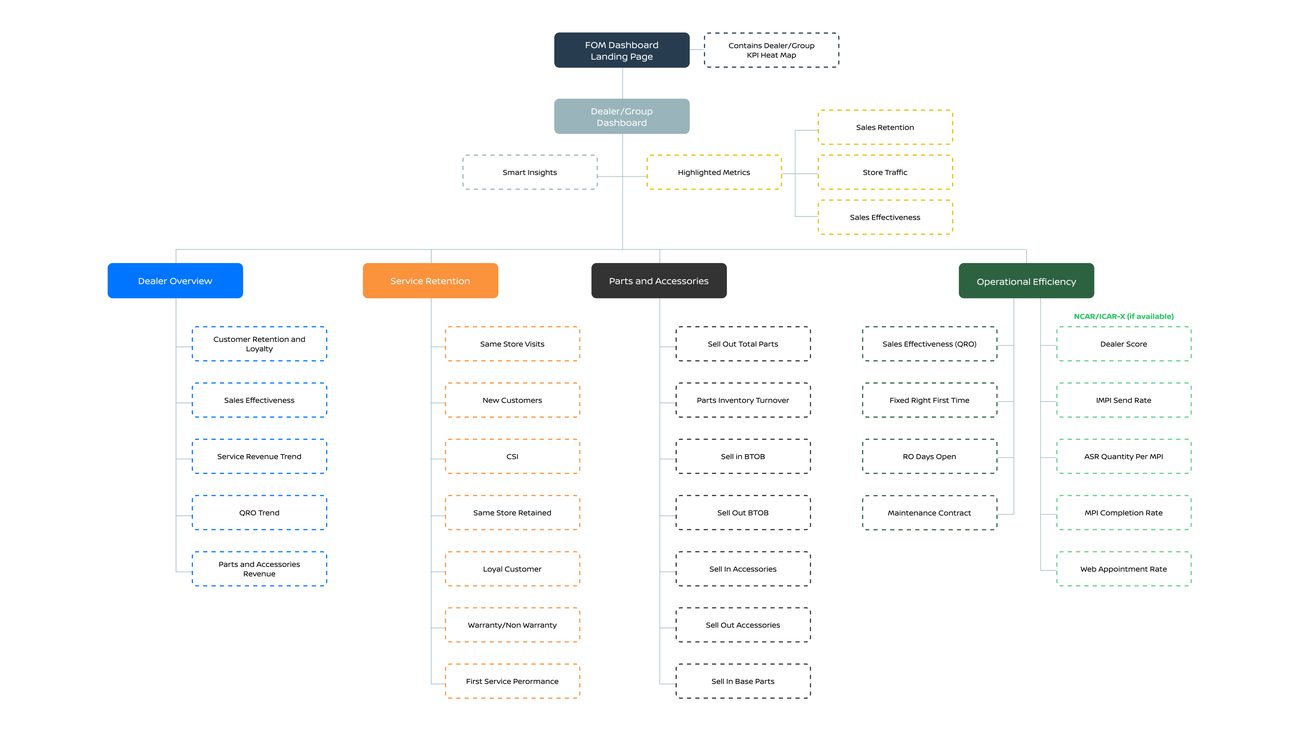
Nissan dashboard information architecture diagram
Information Architecture · Heat Map → Scorecard → Detail
The Design Decision

FOMs don't browse dashboards. They scan them.

A director's stock-ticker chart became the paradigm — a treemap heat map where each tile is a dealer, sized by revenue and colored red-to-green against benchmark. A click opens a scorecard benchmarked four ways at once: Retailer, Region, District, National. A Smart Insights banner surfaces the anomaly worth discussing — scoped deliberately narrow, nothing predictive until the modeling earned that trust.

→ Open full-screen in a new tab
Outcome

A static deliverable, pushed into a working prototype.

The engagement closed with a research-validated design, IA, and roadmap — thirty metrics now, thirteen later, predictive insights only when the data justified them. After the engagement ended, I rebuilt it as a working AI-assisted React prototype, directing Claude the way I'd direct a developer — design decisions mine, implementation AI-augmented.

30
Metrics Shipped
13 More Roadmapped
Rebuilt as a Working AI-Assisted Prototype
Case Study 03 — Big Tech Client

Engineering Onboarding for a Big Tech Client

Client
A Big Tech Client — Ad Platforms Engineering
Role
Design Lead / Client Whisperer

Brought in to rescue a failing project and a damaged client relationship — asked to design a world-class onboarding experience for this Big Tech client's Ad Platforms engineering org. Given my prior experience with this client, my strategic approach, and my ability to read and steady a difficult client situation, I was asked to take the work over — and rebuild the relationship along the way.

25+
Opportunities Mapped
Three Personas, One Six-Month Arc
Post-Offer Through Post-Core Onboarding
Quick Wins Separated From Bigger Bets
Research

What we heard, and the pattern underneath it.

  • Leadership wanted to proactively improve the experience so engineers could do the best work of their life
  • A real desire to stand up a durable onboarding capability, aligned to OKRs
  • Onboarding was the priority — an earlier 2020 attempt had produced recommendations that mostly sat on a shelf
  • Interviews surfaced real back-end and process gaps — this was a service design problem as much as a UX one

The pattern was consistent: new hires got their offer letter, then heard nothing for three weeks. By Day 1, whatever excitement they'd had was mostly gone.

"From setting up your laptop to meeting people, most of the onboarding experience is self-service."— Experienced IC
"I had only met my manager once briefly in the first week, but it was great to meet the team."— Inexperienced IC
Artifact

Mapping three personas across a six-month arc.

The journey map tracked three personas at once — Inexperienced IC, Experienced IC, and Experienced Manager — from Post-Offer through Post-Core Onboarding. A manager's memory of "a great week 1" sat right next to a new hire's memory of "it took a while to be connected." Same event, two different stories.
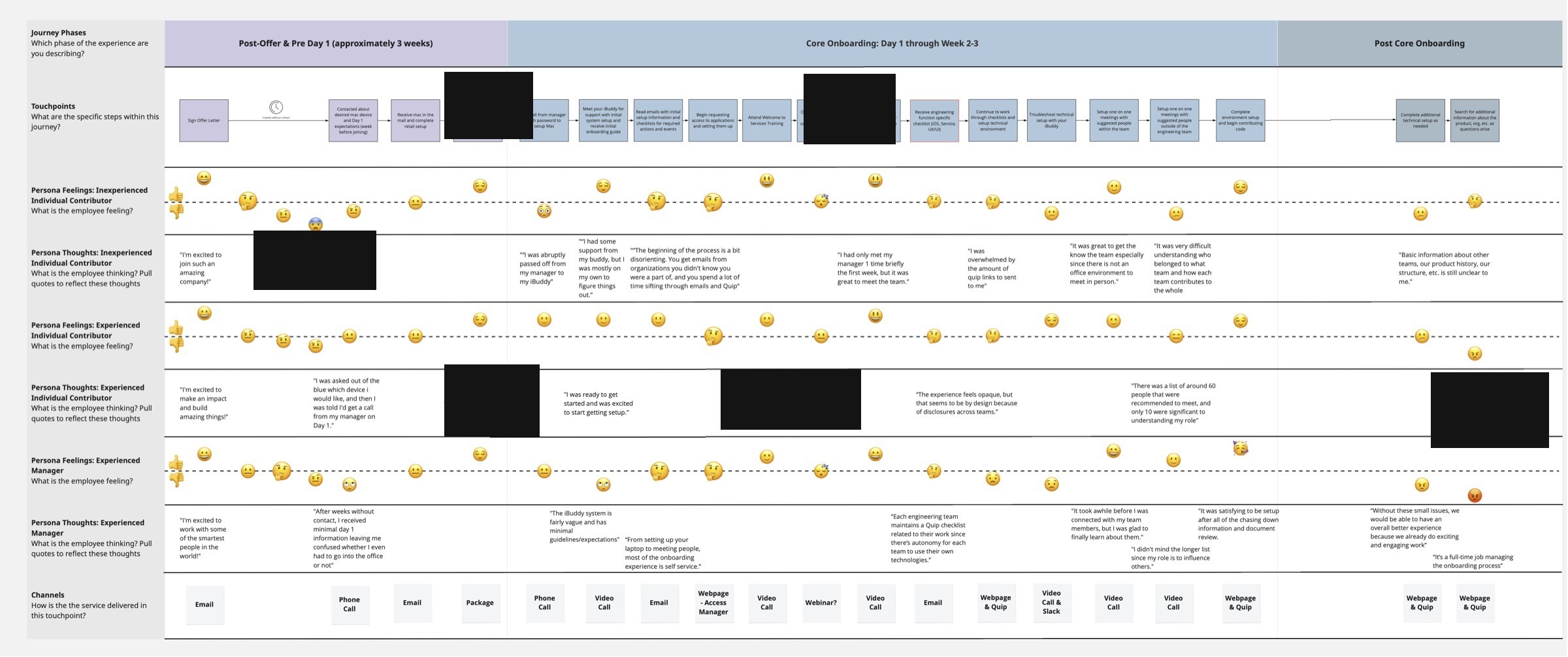
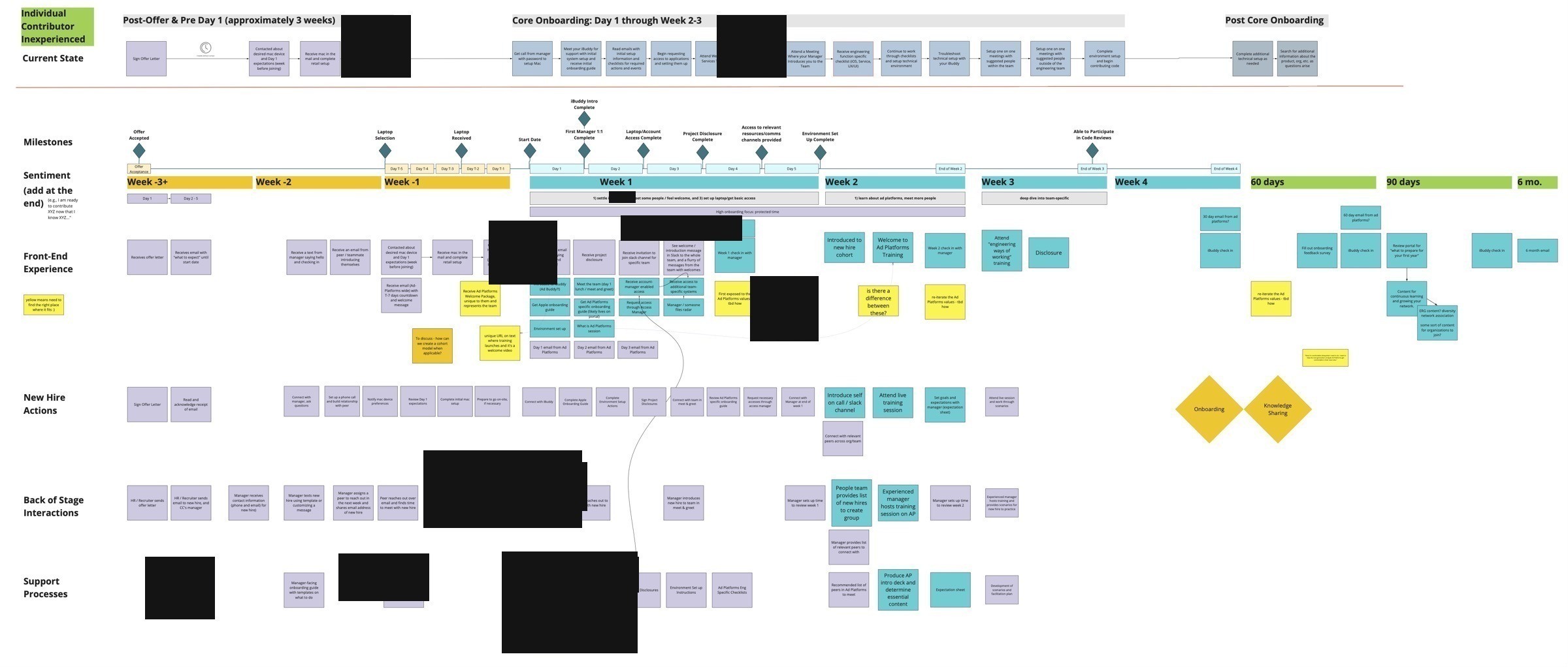
Onboarding journey map across three personas
Artifact · Journey Map
Onboarding service design blueprint
Artifact · Service Design Blueprint
Approach

Quick wins and bigger bets.

With the gaps mapped, we prioritized opportunities on an effort vs. impact matrix — separating what could move the needle right away from what was worth a bigger investment.

  • Quick Wins: a standard welcome email before Day 1, a text from the manager or iBuddy, written 30/60/90-day expectations for each persona
  • Bigger Bets: the onboarding portal itself, gamified checklists, automation of local dev-environment setup — the most friction-heavy part of week one
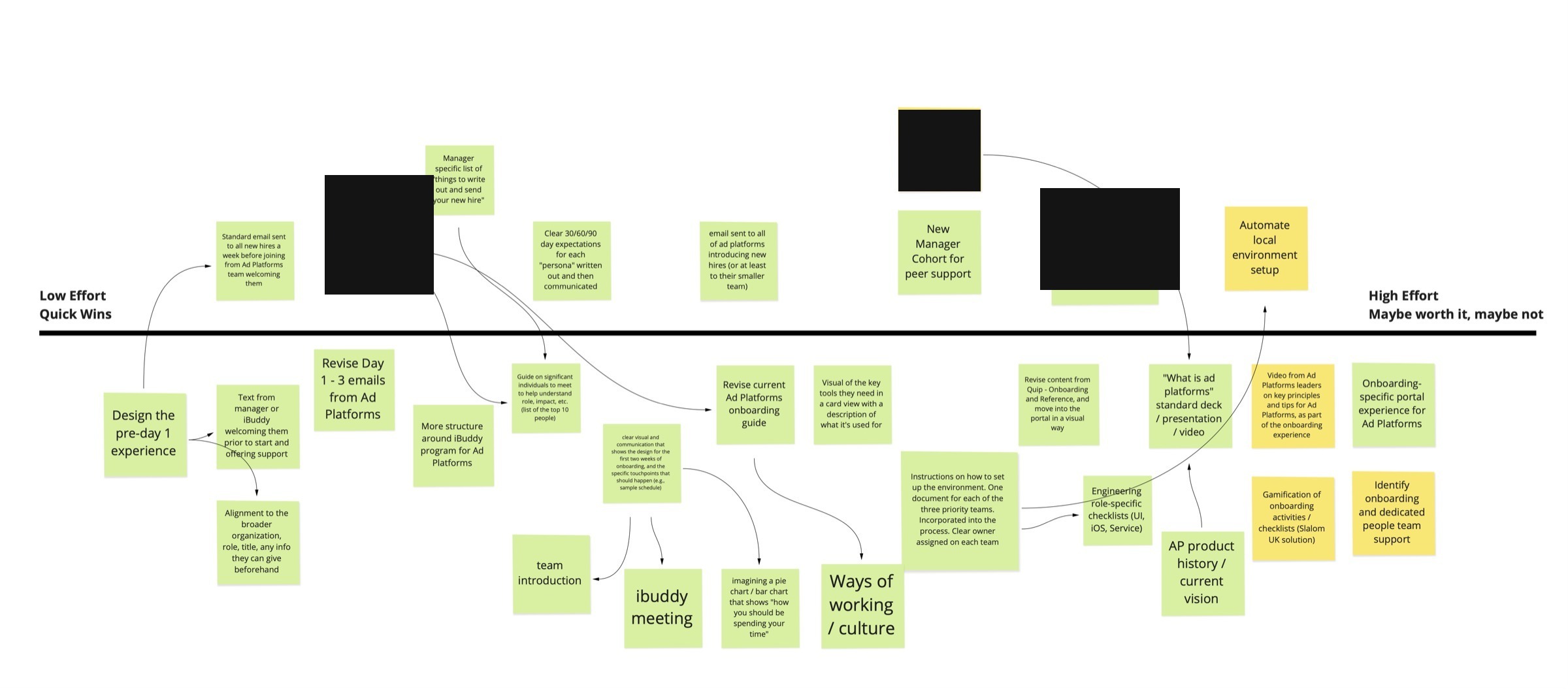
Onboarding prioritization matrix
Artifact · Prioritization Matrix — 25+ Opportunities
The Design

Two layers: the platform, and the personalized wizard inside it.

New hires were greeted by name and walked through a five-section roadmap — from setting up their laptop to their first code review. Warm without being saccharine, unmistakably on-brand for the client without borrowing its consumer design language.

→ Open the interactive prototype
Outcome

Rigor that outlasted the funding.

The project lost funding as we were completing the designs — that happens in enterprise work, and no amount of good design insulates you from it. But the rigorous methodology, the deep understanding of user needs, and the relationship rebuilt with a difficult client made this one of the most valuable engagements of my career.

Case Study 04 — Southwest Airlines

Seat Selection for Southwest Airlines

Client
Southwest Airlines
Role
Design Team Lead

For over 50 years, Southwest ran on open seating — egalitarian, familiar, core to the brand. Ending it wasn't a UI update. It was a fundamental rethink of the experience, rolled out across web and mobile without disrupting an operation this size.

50+
Years of Open Seating
Southwest's first assigned-seating rollout, ever
A new interaction model for millions of returning flyers
Rolled out across web, iOS, and Android at once
Approach

Threading a new model through flows people already trusted.

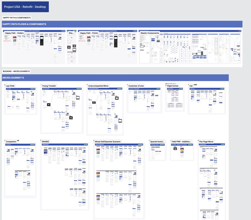
Eleven designers, four from Southwest's internal team. I led the group retrofitting seat selection into mWeb, iOS, and Android — designing for the full matrix of edge cases: lap children, unaccompanied minors, customers of size, companion passes, SWABIZ bookings. Every permutation organized into micro-journeys and accounted for before a line of code was written.
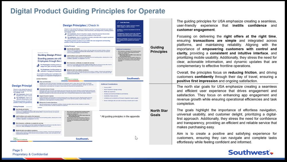
Southwest digital product guiding principles artifact
Artifact · Digital Product Guiding Principles
Artifact

Scoping the work before a single screen was drawn.

A clear breakdown of MVP enhancements and ownership — entry points, bags updates, modify flows, responsive breakpoints — kept nothing falling through the cracks across eleven designers working in parallel.
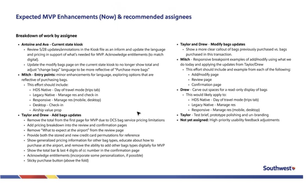
Southwest MVP enhancements and assignees breakdown
Artifact · MVP Enhancements & Assignees
Southwest project USA retrofit flow matrix
Artifact · Retrofit Flow Matrix
Approach

When capacity got tight, we picked up testing ourselves.

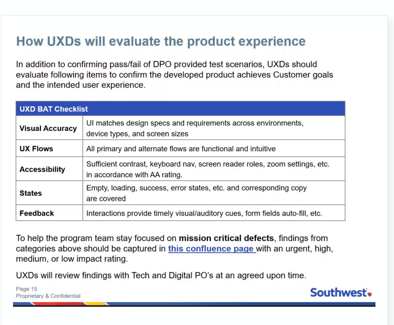
The internal UX team owned Business Acceptance Testing — until capacity became a constraint and our team pivoted to run it directly alongside Southwest. Unglamorous, and exactly the kind of work that separates a project that ships clean from one that ships and needs damage control.
0
Bugs Resolved in 3 Weeks
0
Designers on the Project
0
Platforms
Southwest UXD Business Acceptance Testing checklist
Artifact · UXD BAT Checklist
The Design

Live across web, iOS, and Android.

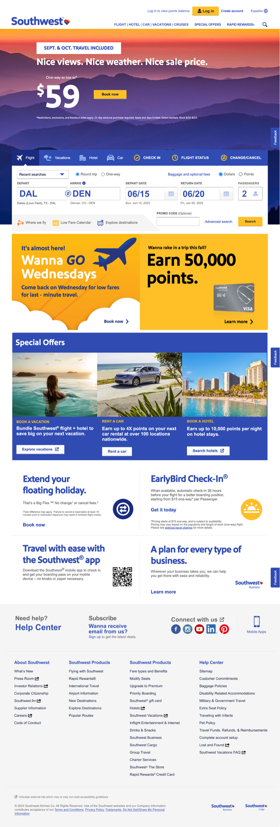
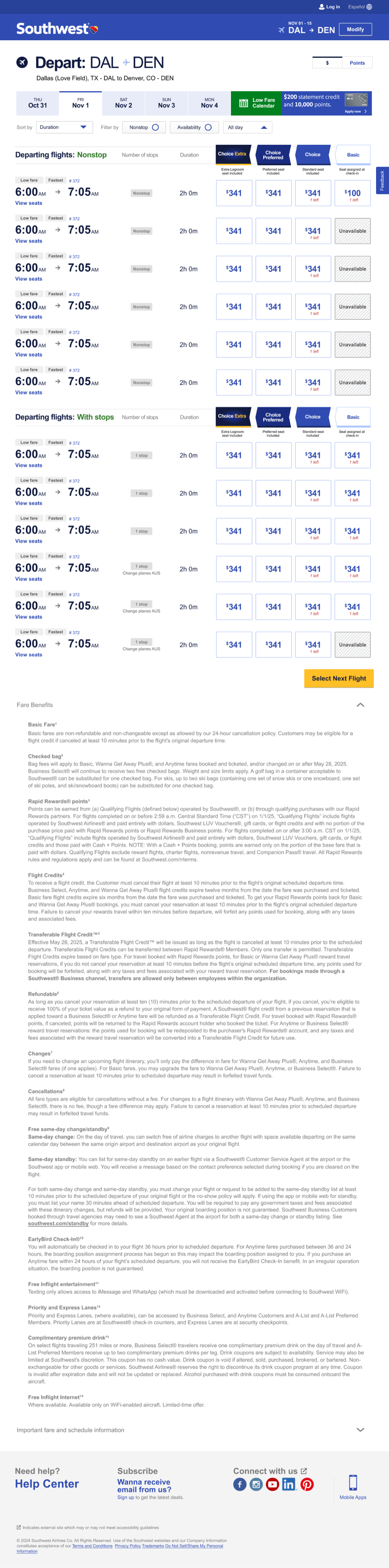
The redesigned experience shipped: a new seat selection model, a modernized booking funnel, and a consistent look and feel that honored the Southwest brand while moving it decisively forward.
Southwest redesigned homepage, full page
Delivered · Homepage (Web)
Southwest fare comparison page, full page
Delivered · Fare Comparison (Web)
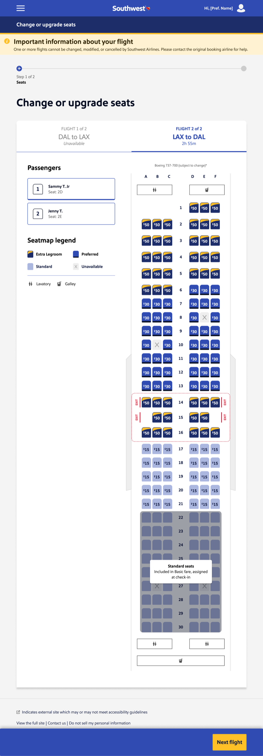
Southwest seat selection screen, full page, web
Delivered · Seat Selection (Web)
Outcome

Good design can make a hard change feel clearer. It can't make it feel good.

What we could control, we controlled well: a seat selection flow that works across web, iOS, and Android, handling the full matrix of edge cases on day one. What I'd do differently — push harder, earlier, for qualitative research with the customers most likely to feel the loss.

A Note on Reception

Ending open seating was unpopular, and the rollout drew real criticism — about the feel of the change, and about the new fare tiers. That decision wasn't ours to make; our job was to design the experience customers would actually use once it had been made. I don't want to hide behind that distinction, though.

Case Study 05 — naviHealth

Patient Transition Suite for naviHealth

Client
naviHealth
Role
Design Lead / Evangelist

Meet Mr. Ouch — your parent, your grandparent, someone tired and hurting who just wants to get home. It takes nurses, care coordinators, intake specialists, and physicians to get him there. Every one of them is a user of naviHealth's products, and the interface was serving none of them particularly well.

Mr. Ouch illustration — the patient at the center of the naviHealth care journey
Research

Card sorting, discovery workshops, and a role-based pitch nobody asked for.

The original engineering ask was a "lift and shift" — a visual facelift, no structural change. Research showed workflows varied a lot by role: a field nurse and a centralized data-entry specialist navigated the same screen to do fundamentally different jobs. That insight became the case for a role-based redesign instead — a conversation that changed how UX was valued on the project.
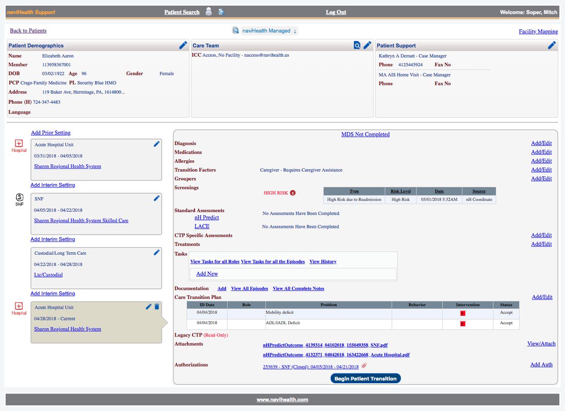
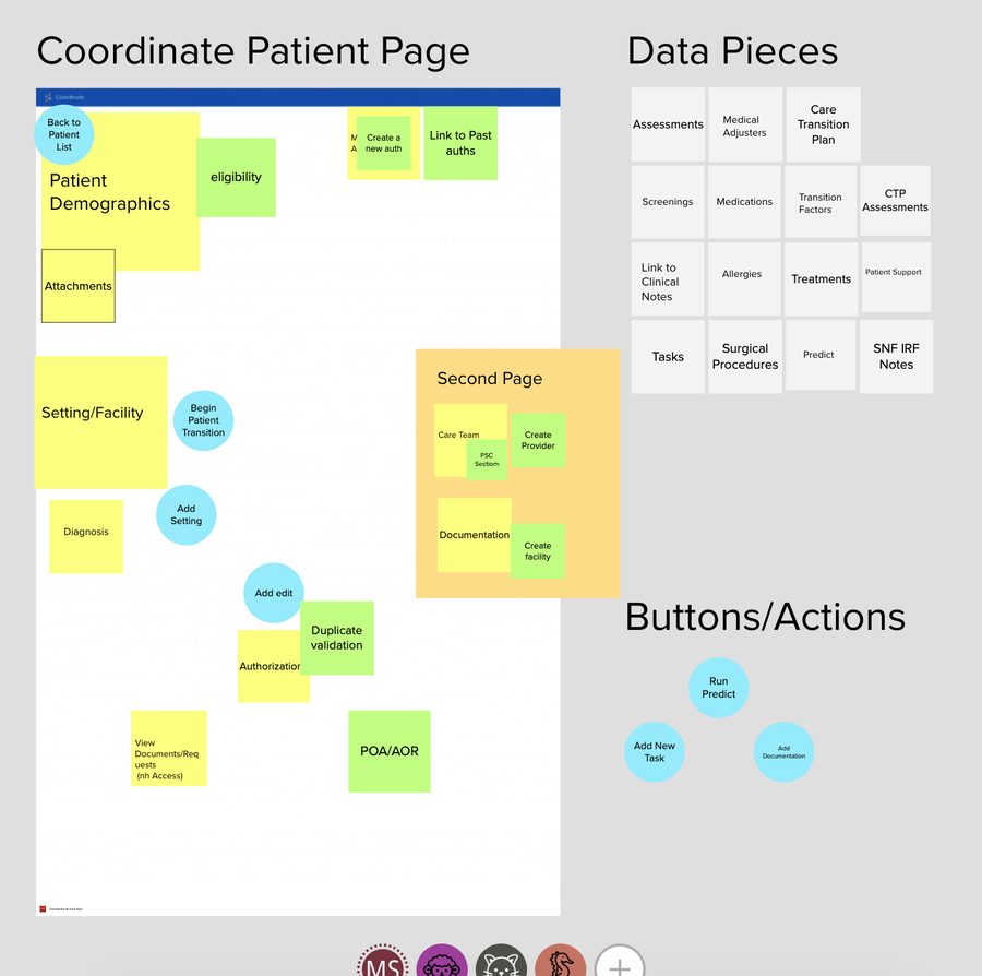
naviHealth legacy Coordinate patient page, dense and dated
The Starting Point · Legacy UI
naviHealth card sorting research session
Research · Card Sort & Data Mapping
Artifact

Reorganizing around the F-Pattern, not the database.

The legacy layout forced an inefficient, non-linear scan just to complete basic tasks. Mapping the data users needed most against the F-Pattern — the natural eye-tracking path people take through dense interfaces — put the right data in the right place and cut cognitive load.
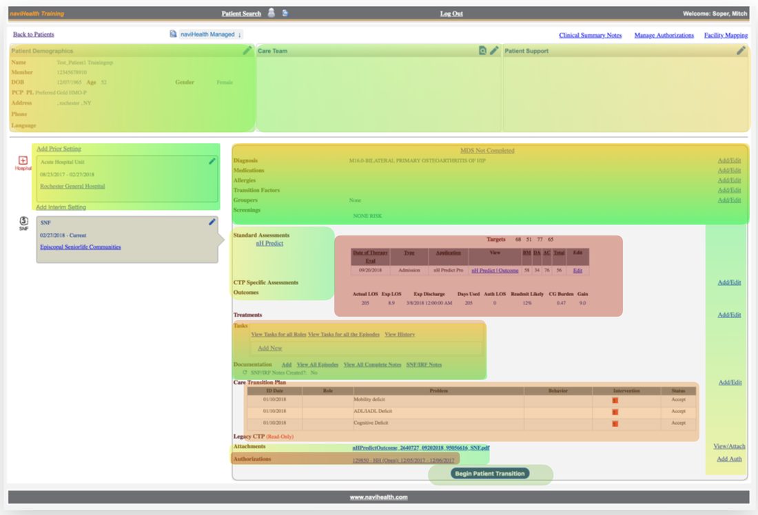
naviHealth eye tracking and information architecture analysis
Artifact · Eye Tracking & IA Analysis
Approach

Staying lo-fi on purpose.

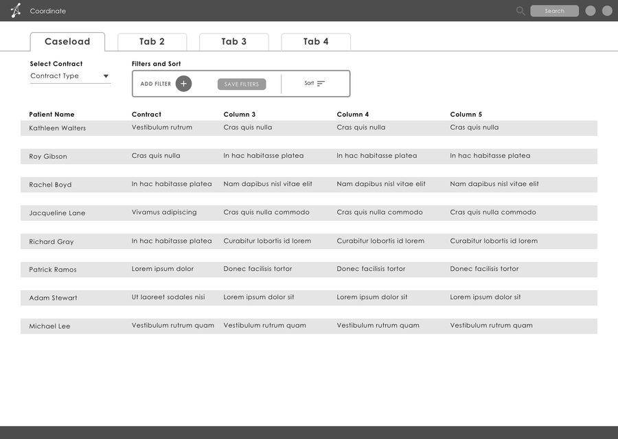
Low-fidelity wireframes kept users focused on layout and interaction, not visual polish still being developed in parallel — letting people give honest feedback on structure. Testing surfaced real efficiencies, like re-sequencing tasks to cut extraneous clicks — observations from the people doing the work, not designer opinions.
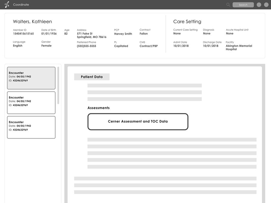
naviHealth patient page wireframe
Wireframe · Patient Page Redesign
naviHealth caseload dashboard wireframe
Wireframe · Caseload View
The Redesign

Reorganized around clinical workflow, not the database.
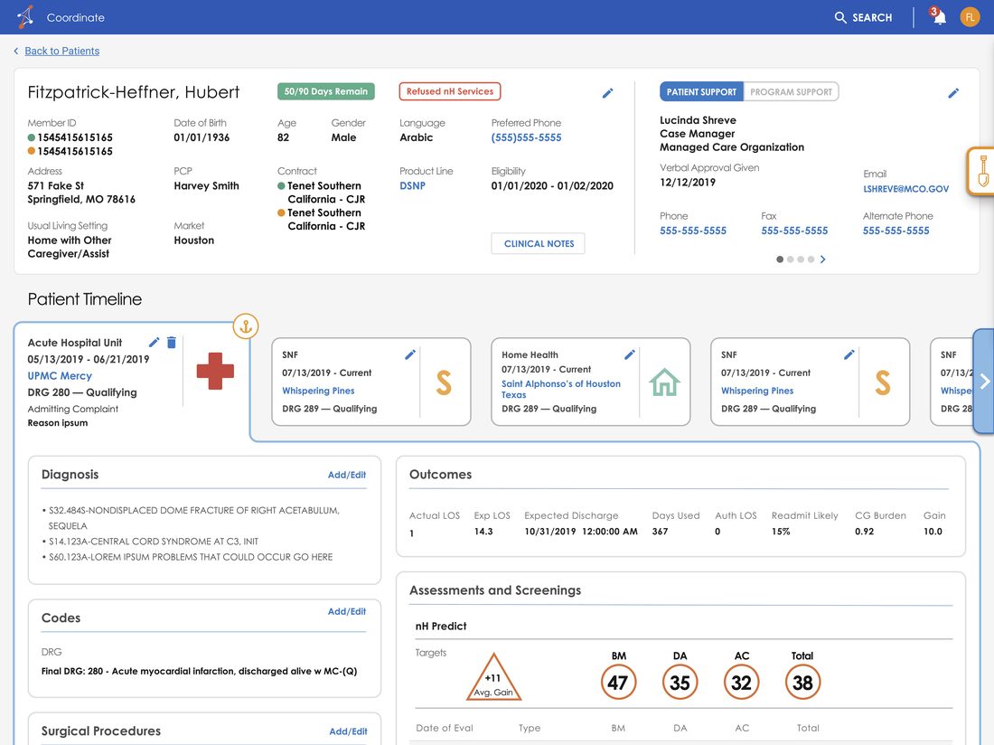
naviHealth redesigned Coordinate patient page
naviHealth legacy Coordinate patient page
Before After
← drag to compare →
Outcome

From an addendum to an integral part of product direction.

A user-centered approach increased trust in UX from both Product and Engineering. When I left naviHealth, the UX team was helping define product direction — not treated as an addendum to supply visual design.

0
Satisfaction & Retention
0
Speed to Task Completion
0
Accuracy
Case Study 06 — HCA Healthcare

Website Experience for HCA Healthcare

Client
HCA Healthcare
Role
Design Lead / Researcher / Workshop Lead

No redesign since 2016. Years of uncoordinated stakeholder edits left a fractured, patchwork site — outdated content, broken navigation, no shared sense of purpose. A platform migration created the forcing function: redesign it, align internally, and build the governance to keep it from fragmenting again.

10
Years Since the Last Redesign
Years of uncoordinated stakeholder edits
No shared governance model
A platform migration as the forcing function
Research

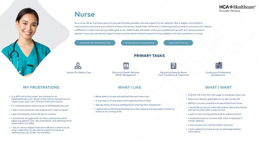
31 interviews. Surveys from 70+ physicians and nurses. Seven personas.

A team of six designers and researchers ran 31 one-on-one interviews with potential patients, reviewed survey responses from more than 70 physicians and nurses, and gathered input from a dozen business leaders — all within a few weeks. Clustering and affinity mapping produced seven grounded personas that gave the whole team a shared language.
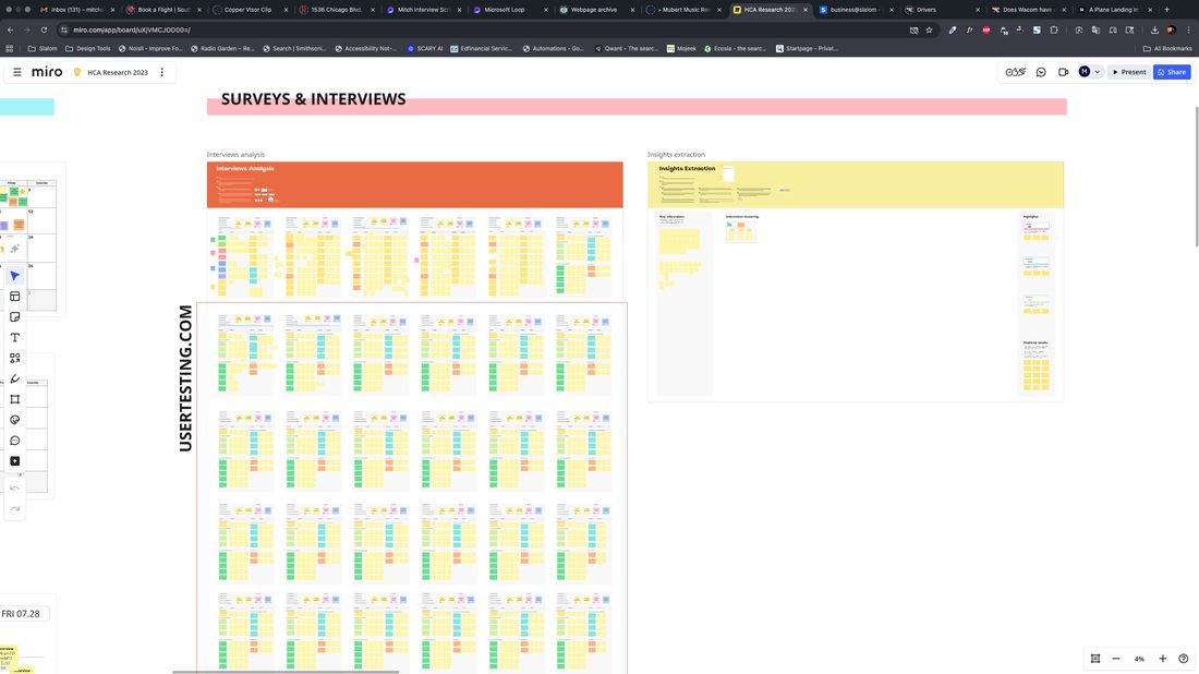
HCA research synthesis Miro board of survey and interview data
Research · Surveys & Interviews
HCA nurse persona
Nurse — click to enlarge
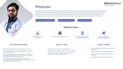
HCA physician persona
Physician — click to enlarge
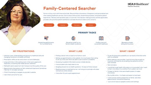
HCA family searcher patient persona
Patient — click to enlarge
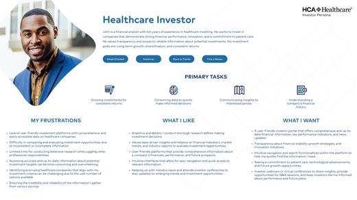
HCA investor persona
Investor — click to enlarge
Artifact

The most significant finding was one nobody expected.

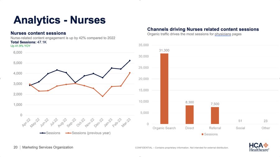
An analytics deep-dive with HCA's Marketing Services team mapped what people were actually looking for and where they dropped off. A substantial share of traffic was people hunting for career content — buried several levels deep. They were finding it despite the site, not because of it. That reframed the whole priority list.
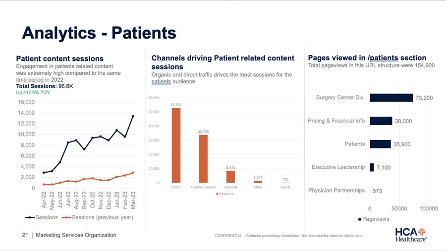
HCA analytics dashboard for patient traffic
Analytics · Patients
HCA analytics dashboard for nurse traffic
Analytics · Nurses
Approach

A shared vocabulary, built in the open.

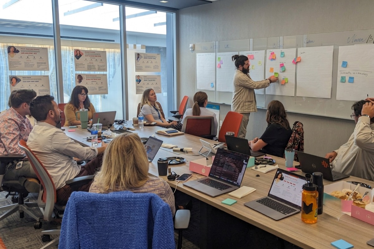
I facilitated a four-hour workshop walking stakeholders through all seven personas, running How Might We exercises, then live-sorting ideas with group dot-voting.
In parallel, I ran an independent heuristics analysis against Nielsen's ten usability principles — then held learning sessions with HCA's own engineers to explain what heuristics are and how to apply them. The deliverable mattered, but the knowledge transfer mattered more.
HCA stakeholder workshop with the team sorting ideas on whiteboards
The Workshop · Four Hours, Seven Personas, One Room
Artifact

Three directions, presented to leadership for input.

Grounded in the research and guided by the personas, the team produced three distinct directions — low-fi wireframes through mid-fidelity visual explorations — before landing on a serious modernization that stayed inside HCA's style guide.
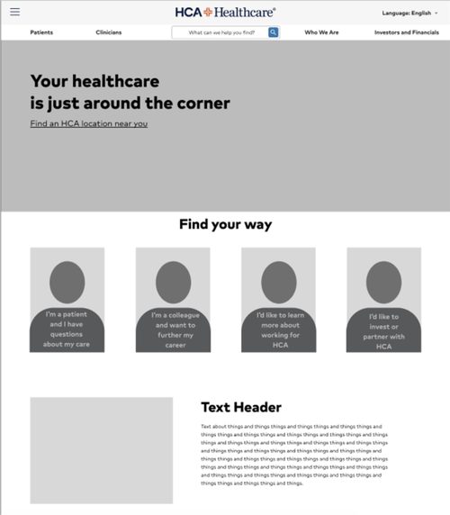
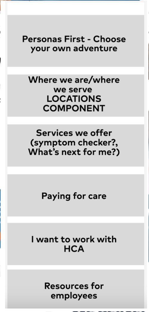
HCA design direction 1
Direction 01
HCA design direction 2
Direction 02
HCA design direction 3
Direction 03
The Design — "We Show Up"

Modernized, without losing HCA's warmth.

A modernized homepage balancing patient, provider, and investor needs within HCA's existing style guide — a serious step forward that still feels unmistakably HCA.
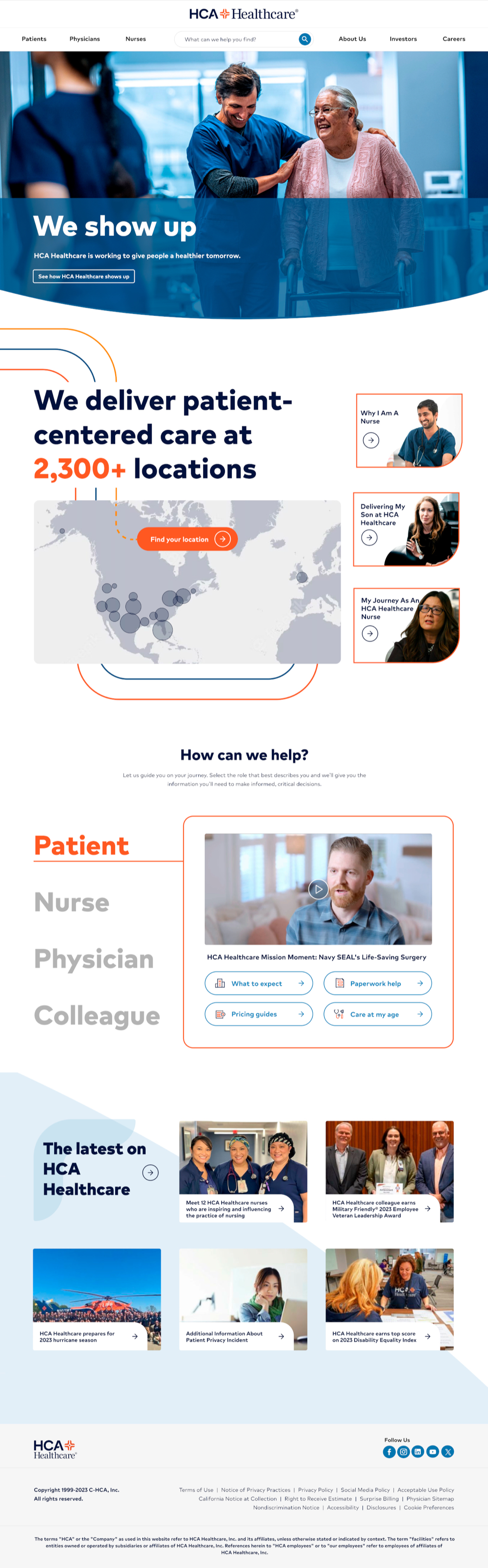
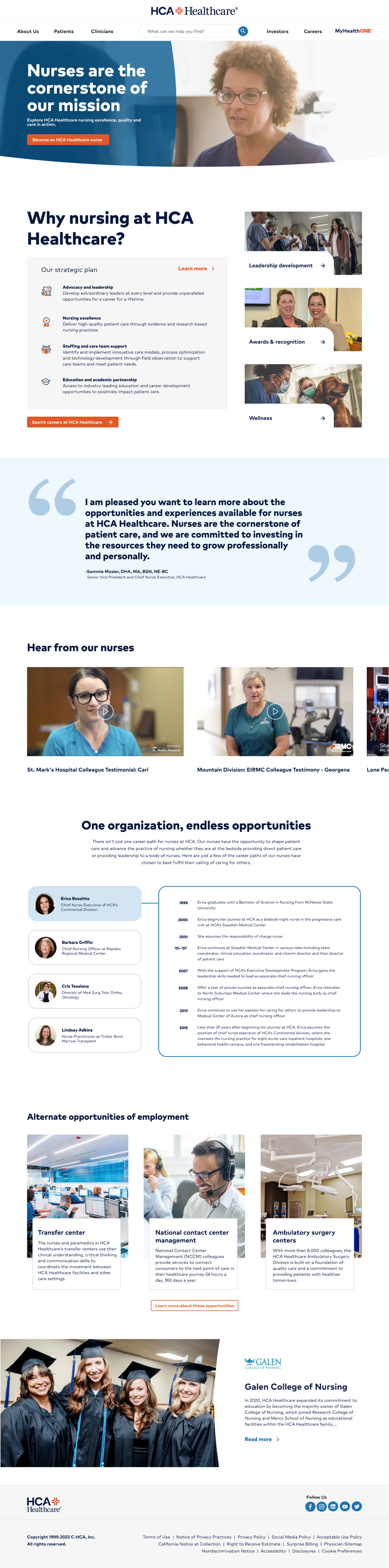
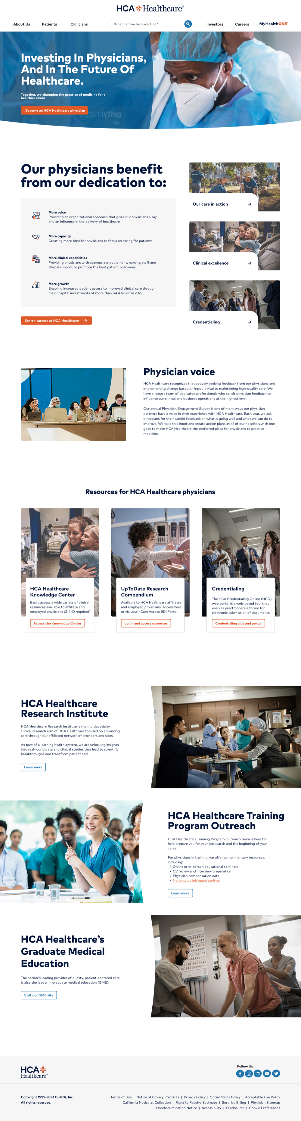
HCA redesigned homepage, full page, scrollable HCA redesigned nurse landing page, full page, scrollable HCA redesigned physician landing page, full page, scrollable
Outcome

From assumption-based to evidence-based design.

The project delivered a research-validated, stakeholder-aligned foundation — interactive prototypes, a new IA, and the governance to keep things from fragmenting again. The lasting outcome was bigger: HCA moved from assumption-based web management to evidence-based design. The career-content finding is the clearest example — nobody would have guessed it. It came from data and listening.

Side Project — Travel Dash

Built with AI. Shaped by the friends actually using it.

I'm a "digital nomad" these days, driving across the country while picking up freelance work. I AI-built this shared trip calendar, then kept iterating from the road — new features shipped based on real feedback from the friends actually using it to track where I'll be.

→ Open Travel Dash in a new tab